Chapter 6
Everything I made during design school

For its size, Rhode Island has a lot going for it. That includes a major bridge at risk of collapse, drivers that don’t understand the concept of right-of-way, and a little school of design. That was my school for three years as I was a graduate student studying graphic design. I spent those years creating close to a hundred projects and sleeping very little. Those projects — well, some of those projects — would go on to serve as the foundation for my professional practice. In this chapter, I’ll share the projects I made while studying at RISD to reveal the ways in which the school helped me grow as a designer and start my career.

Scroll Right

Fall 2021

My first semester at RISD was a whirlwind. I had learned a lot as a freelance designer already, but I found myself struggling at the basics — things like understanding what made a design “good” or successful. RISD’s three-year MFA in Graphic Design offered me a chance to get on my feet before tackling headier projects. This meant taking courses structured more like an undergraduate curriculum covering history, form, and typography.

History of Graphic Design, taught by Doug Scott

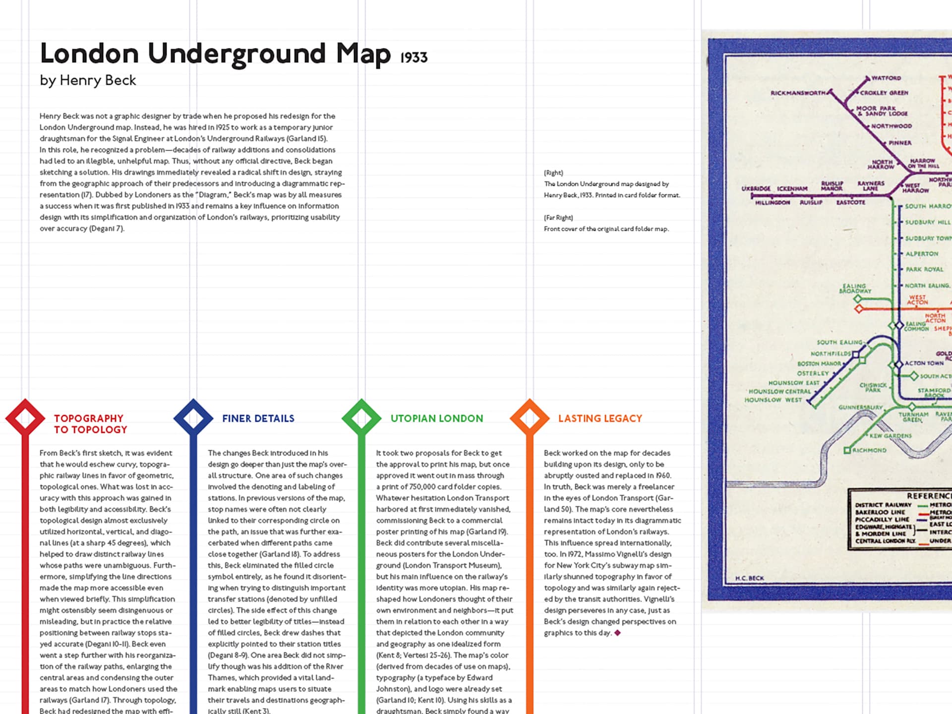
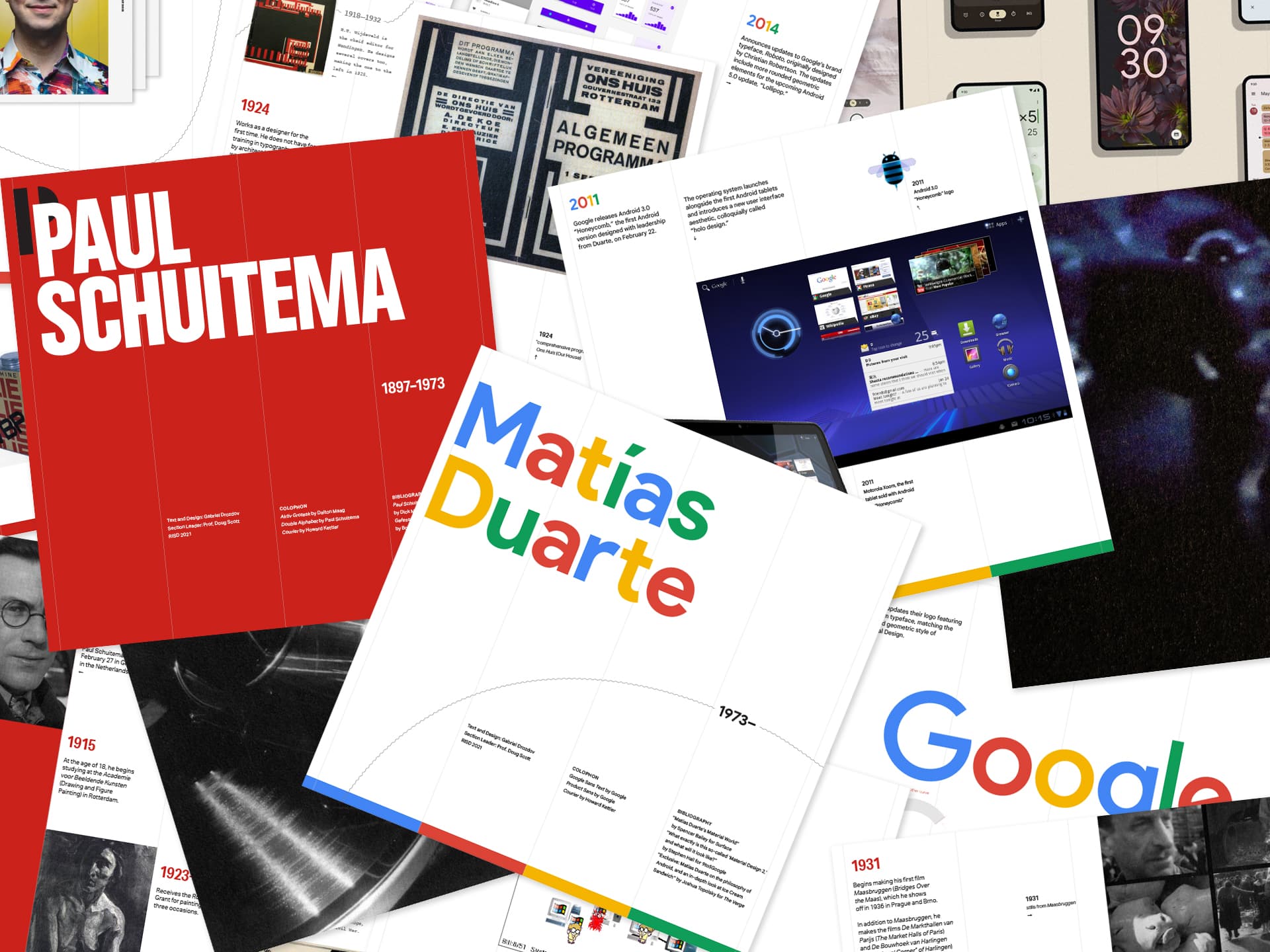
Doug’s course covered basically everything I needed to know for my entire time at RISD. By learning how different design aesthetics and practices emerged, I found myself able to analyze existing designs and make informed decisions in my own work. Besides listening to lectures, Doug had us learn by assigning projects that engaged with historical and contemporary references and figures.

What I Learned

Historical references for major art movements
Vocabulary for describing typography and form
Methods for quickly iterating on a design
Reasons for picking a font
How to find connections between form and content
Craft and technique for making posters and books

Graduate Form I, taught by Tom Wedell

Tom’s approach to form was particularly cinematic and photographic. He had us working with our hands and with cameras, discovering form from real, physical objects instead of crafting it out of nothing. At first, I found this exceedingly difficult because we were designing without content to design for. But what Tom helped me realize was that there were formal aspects of design that made an image or composition compelling even without content to rely on.

What I Learned

How to print and crop a poster
How to edit and prep an image file for print
Methods for creating forms from physical objects
Vocabulary for describing form
Techniques for designing interesting compositions

Graduate Type Studio I, taught by Nancy Skolos

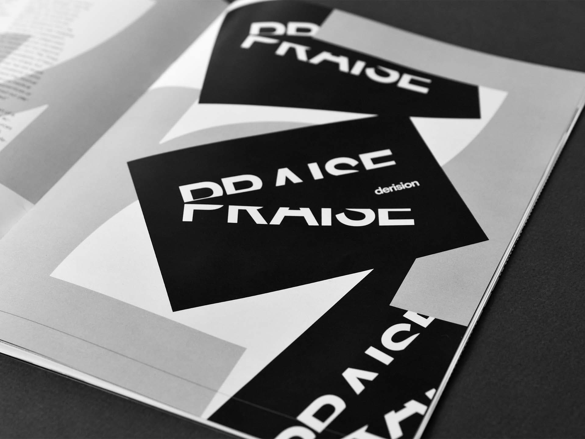
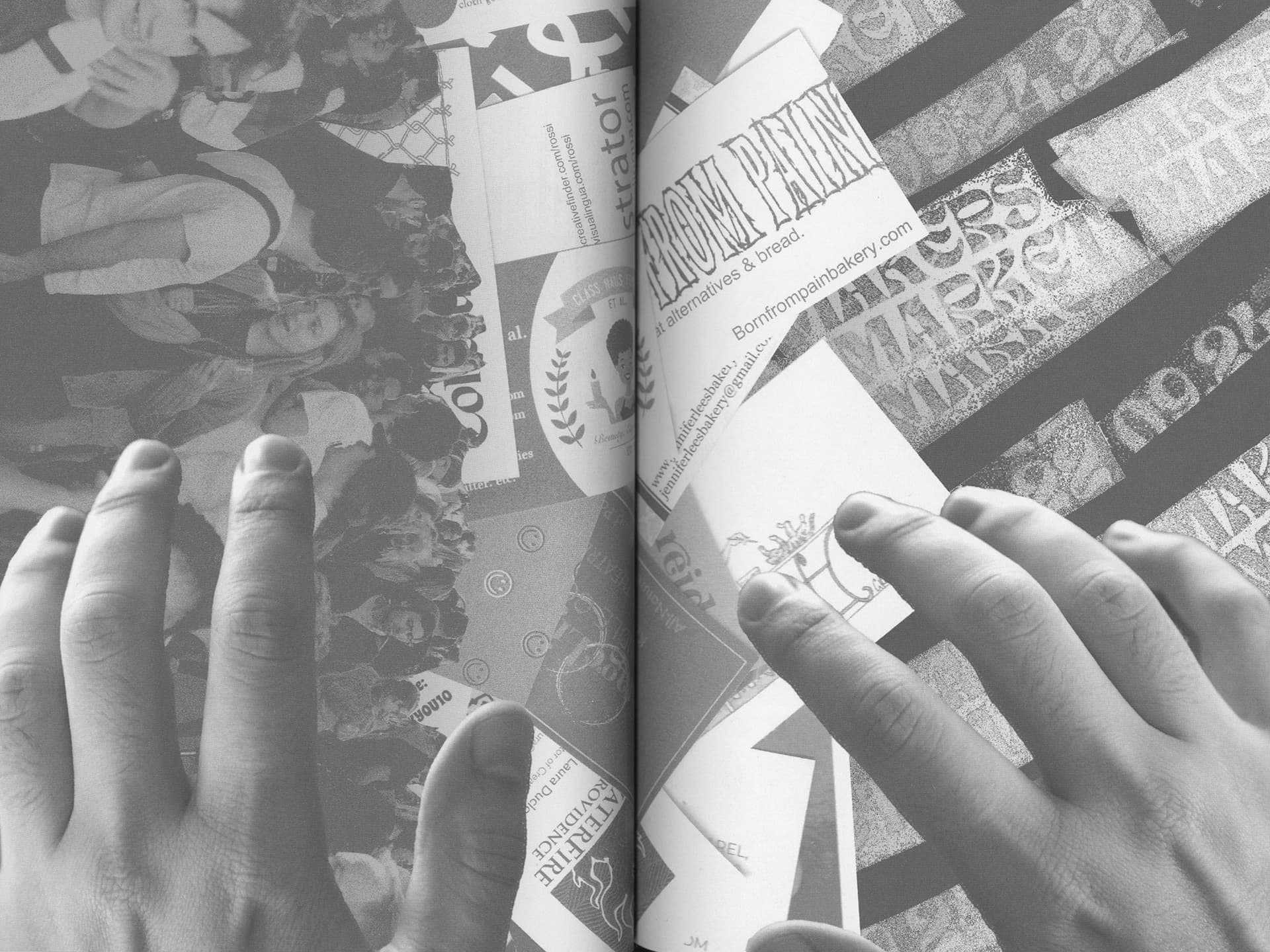
Nancy’s approach to typography was expressive and experimental. Tom was her husband, and the two of them had a long and impressive career creating poster designs together, with Tom primarily managing form and Nancy in charge of type. Nancy had us thinking deeply about the aesthetic qualities of letterforms, and then thinking about ways to create compositions out of just letters or combining type with image. We practiced these concepts through a series of exercises that culminated in a “process” zine showcasing our best outputs.

What I Learned

Methods for playing and experimenting with type
Ways to connect type and image
Techniques for good typesetting and ragging text
How to prep an InDesign file and print as a booklet

Graduate Seminar I, taught by Anther Kiley

Anther’s course was a good foil to Doug’s, in this case focusing more on contemporary theories and practices for graphic design than on historical examples. We read and discussed theories leading to (and then reacting to) Modernism, and then created work that had us dissecting what these big concepts meant to us. This was the first time I really questioned what “graphic design” was, which felt like an essential step toward finding my own creative voice.

What I Learned

Contemporary references for design theory
Methods for applying design theory to my work
About the ideas of the others members in my cohort!

Collegiate Teaching: Preparation + Reflection, taught by Nancy Friese

I went to grad school in part to become a teacher, and Nancy’s course was the first in a concentration on collegiate teaching. Her seminar was extremely practical and involved creating a teaching portfolio. That meant writing a teaching philosophy, diversity statement, several course descriptions, and a syllabus. This was my first time ever creating these kinds of materials, which was challenging in part because I didn’t feel qualified to do so yet. But even so, this work served as the foundation of what I taught later on at RISD.
What I Learned

What a teaching portfolio is
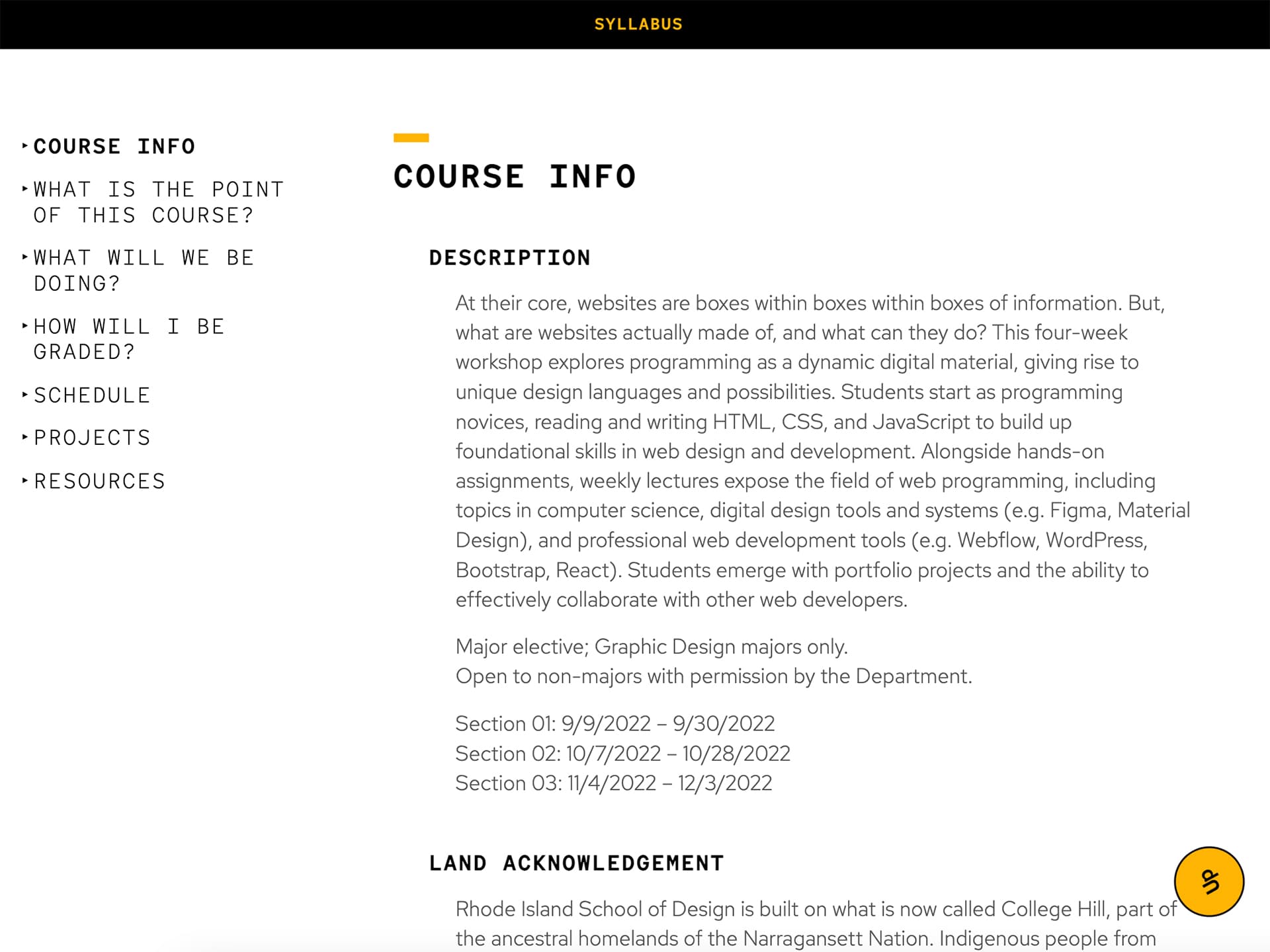
How to write a syllabus
Prospects for careers in teaching

Winter 2022

RISD’s curriculum includes mandatory wintersessions that offer students a chance to take an elective outside of their department. I was curious about the Digital + Media department, which seemed like a good match for my interests but wasn’t on my radar when I was applying to grad schools. So, this was my chance to take a course in the department and see what it was all about.

Of Sound and Vision, taught by Mark Cetilia

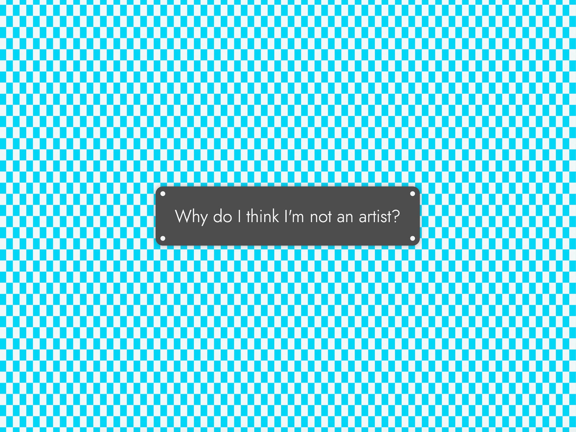
Mark taught a primer in the Max visual programming language that covered both generative audio and video using MSP and Jitter. If you’re confused, just know that Max is basically an app that lets you plug sounds, images, and code together to see what comes out. I thought that this kind of process could be useful in my work, but discovered that our focus was primarily on experimentation and artistic output rather than on communication. That helped me realize I was in the right department — I wanted to be a designer, not an artist.

What I Learned

Practices for generating art using Max/MSP/Jitter
That I didn’t want to be an artist

Spring 2022

If I spent my first semester developing a vocabulary for design, I spent my second semester putting that newfound knowledge into practice. My projects became more technical, shifting away from abstract exercises and moving toward tangible outputs. That meant making things like books, typefaces, and websites. More than any other semester at RISD, this semester (particularly Marie’s Web Type course) exposed me to the topics and skills that would become key components of my creative practice.

Graduate Form II, taught by Olya Domoradova

Olya’s course, which felt like my first real “graduate” course, followed in the footsteps of a syllabus written by Cem Eskinazi. Unlike Graduate Form I, which was about image and composition, Graduate Form II was about process. We had assignments that required us to do things like analyze work we liked, experiment with a tool for an extended period of time, set up conditional design scenarios, and develop a consistent design regimen.

What I Learned

Processes for generating form
Methods for analyzing form
Techniques for experimenting with tools
How to write conditional design prompts

Graduate Type Studio II, taught by Lucy Hitchcock

Lucy guided us through several “real world” projects including the design for a magazine editorial, a music festival identity, and a full-length book. These prompts put an increased focus on craft, both in our designs but also in the physical production of our work. The challenge therein was finding how to insert our own voices into highly-polished outputs that fit specific formal requirements.

What I Learned

Typesetting for magazine editorials
Methods for generating typographic ideas quickly
Typography in relation to brand identity
How to adapt a design for multiple assets
Process for designing, printing, and producing a book

Exhibit Design, taught by Doug Scott

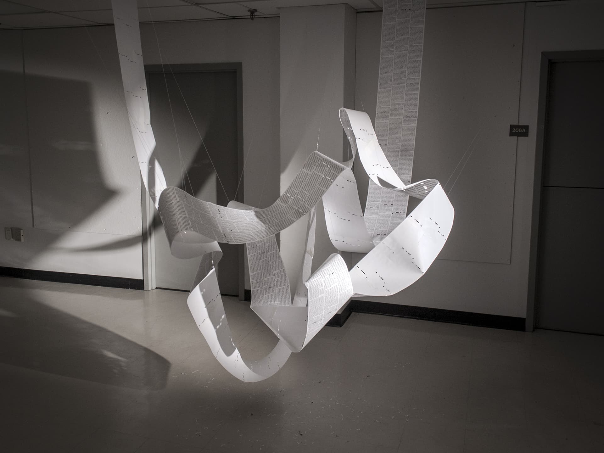
Another class with Doug! This time, Doug had us create physical models spanning a series of exhibition scenarios. Even so, the emphasis was less on creating elaborate models and more on crafting unique experiences for potential audiences. This was particularly challenging for me because I felt more comfortable with software than with my hands. What I learned was that working physically brings you one step closer to the actual experience of someone walking through your exhibition.

What I Learned

Techniques for building physical models
Three-dimensional thinking
Typesetting text for exhibitions
Methods for finding inspiration in physical materials
References for exhibition designers and architects

Graduate Type Design, taught by Cyrus Highsmith

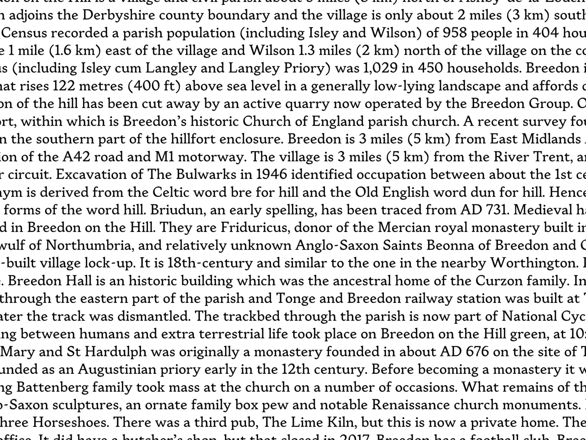
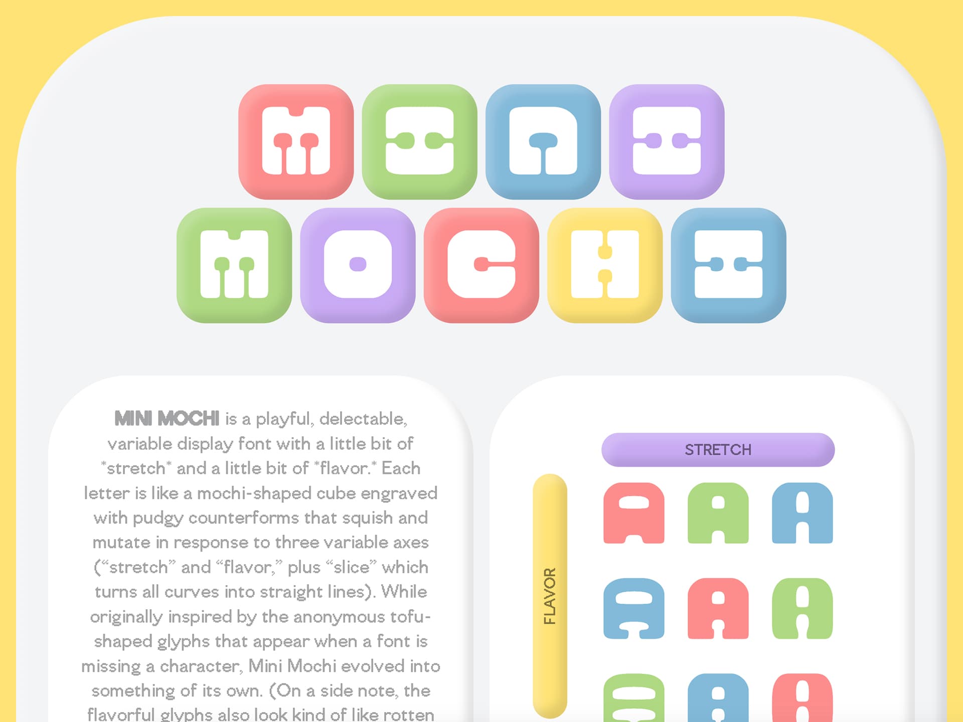
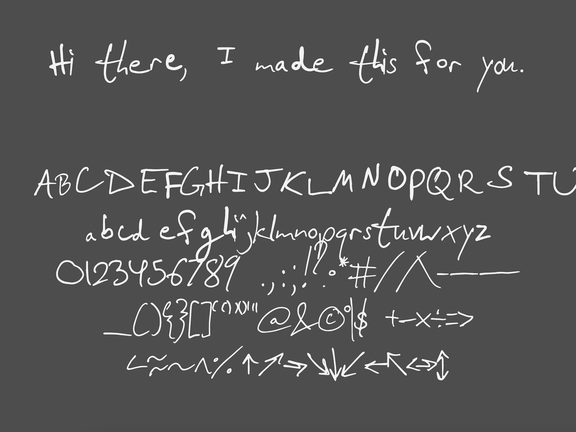
Cyrus’ approach to type design focused on the rhythm created in and between the positive and negative spaces of letters. We went through a series of drawing exercises, building our own pens and looking closely at what gives a letterform its distinct voice and character. After that, we designed our first ever fonts — specifically, pixel fonts, made up of square units. Finally, we worked on original “body” fonts designed for typesetting paragraphs of text. I learned that I really enjoyed the process of analyzing pre-existing typefaces to see the secrets of their construction, and then incorporating these ideas with a personal twist in my own font.

What I Learned

Pixel font design
Body and serif font design
Methods for analyzing typefaces
That I was not good at drawing letterforms by hand

Web Type, taught by Marie Otsuka

Marie was a type designer and coder who worked with Cyrus at his type foundry, Occupant Fonts. Whereas Cyrus taught us what was essentially traditional type design, Marie taught us a more experimental form of typography that involved motion. We created things called “variable” fonts, which you could easily animate on websites. So, we also created digital web specimens for trying out our typefaces. But more than anything else, I learned about the wide range of creative uses for technical skills like type design and coding. After Marie’s course, I would continue to use these skills in virtually every project I made while at RISD.

What I Learned

How to code a website (HTML, CSS, jQuery)
Typesetting text for the web
Variable font design
Techniques for coding digital type specimens
Processes for pulling in data from APIs

Summer 2022

At this point, I had never had a position at a design company. Fresh off of Doug’s course in exhibition design, I got an internship on the Visual Experience Design team at the NYC-based exhibition design firm Local Projects. This would prove to help me understand what it’s like to design in a more formal role, as well as to see how what I learned in school related to what designers were actually doing in the industry today.

Local Projects

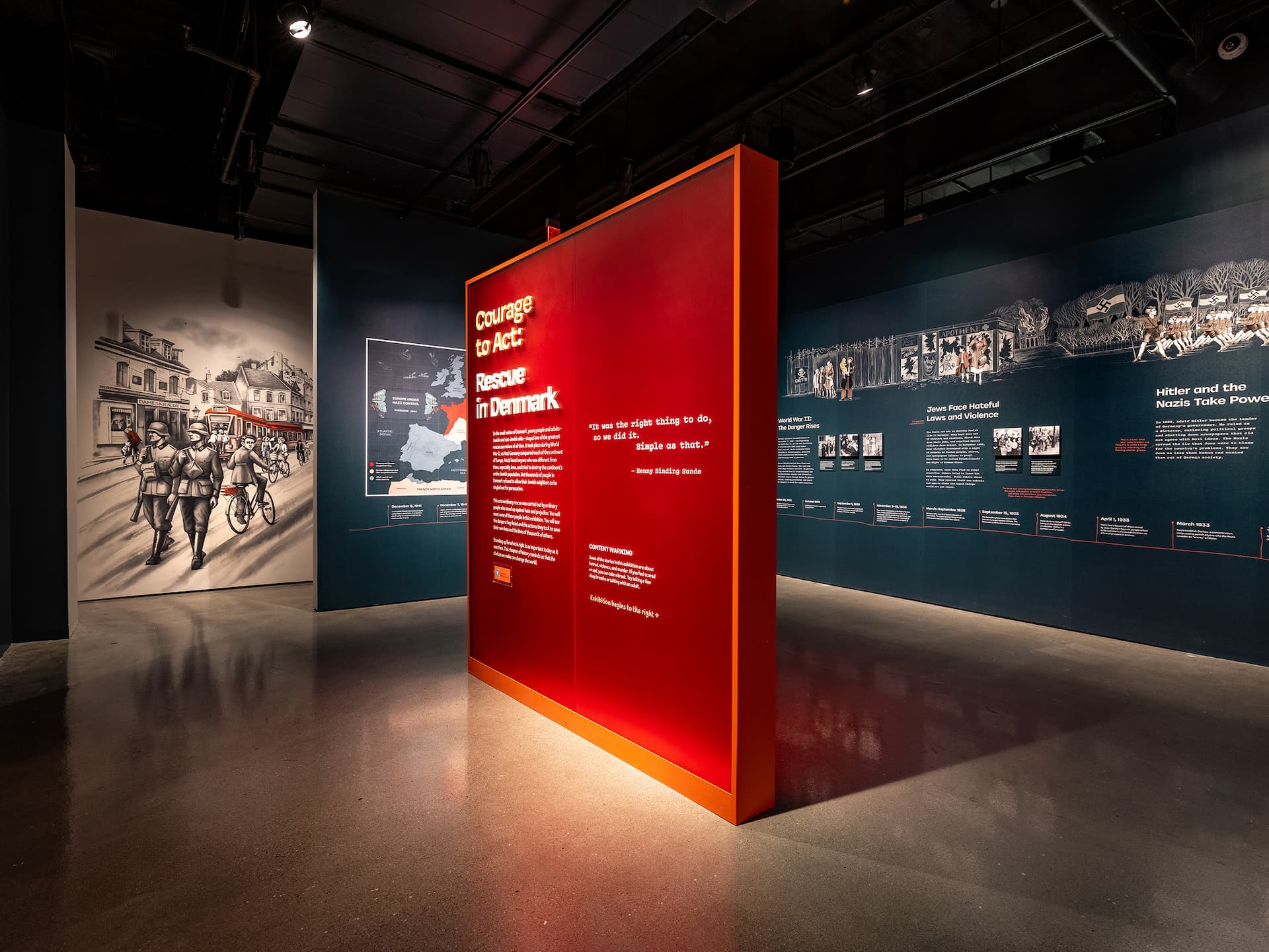
Working with my supervisor Olivia Crosby, I was involved in three projects, each at different phases of completion. This was extremely convenient because it essentially gave me a crash course on every phase of exhibit design — concept/schematic design, design development, and final design. But unlike the exhibit design course I had just taken the prior semester, I worked exclusively digitally (although there were some physical models in our studio). My responsibilities consisted of fine-tuning slide decks and InDesign files (yes, exhibition design apparently happens in InDesign!), sketching ideas, organizing visual research, and mocking up wall designs on top of renders completed by the in-house 3D team. Besides those three projects, I also collaborated with the Creative Technologist intern Ekemini Nkanta on a prototype for an AR mirror concept.

What I Learned

Workflow for designing elevations in InDesign
Formatting for client slide decks
How to sketch design concepts
Methods for pitching ideas to a team
Tips for navigating office politics

Fall 2022

Now in my second year at RISD, my cohort doubled in size to include the incoming students starting the 2-year MFA program. Working alongside seven new peers, we began working on things that were more in line with a graduate curriculum — open-ended projects that forced us to explore our values and develop a personal voice.

Graduate Studio I, taught by Bethany Johns and Ramon Tejada

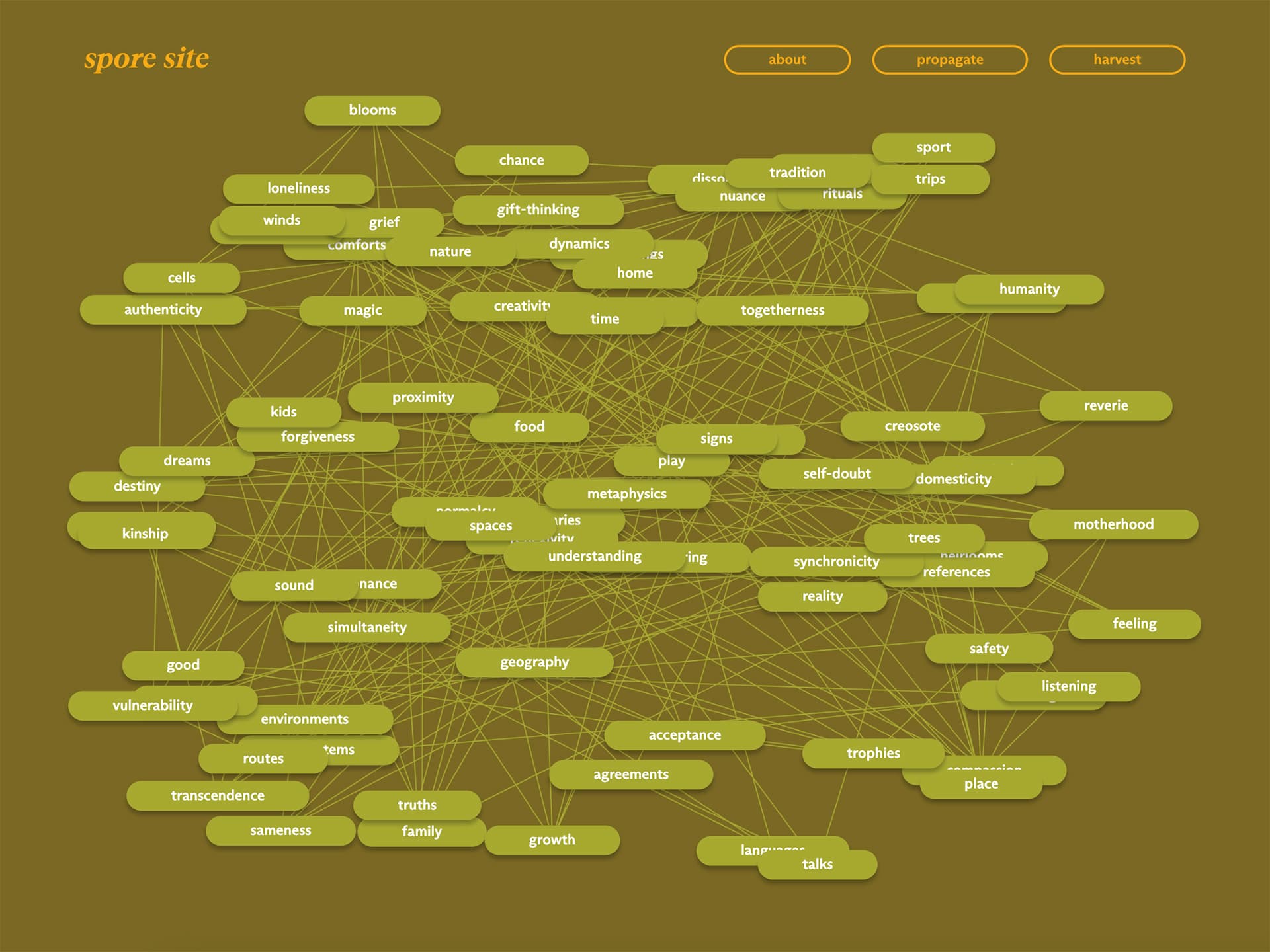
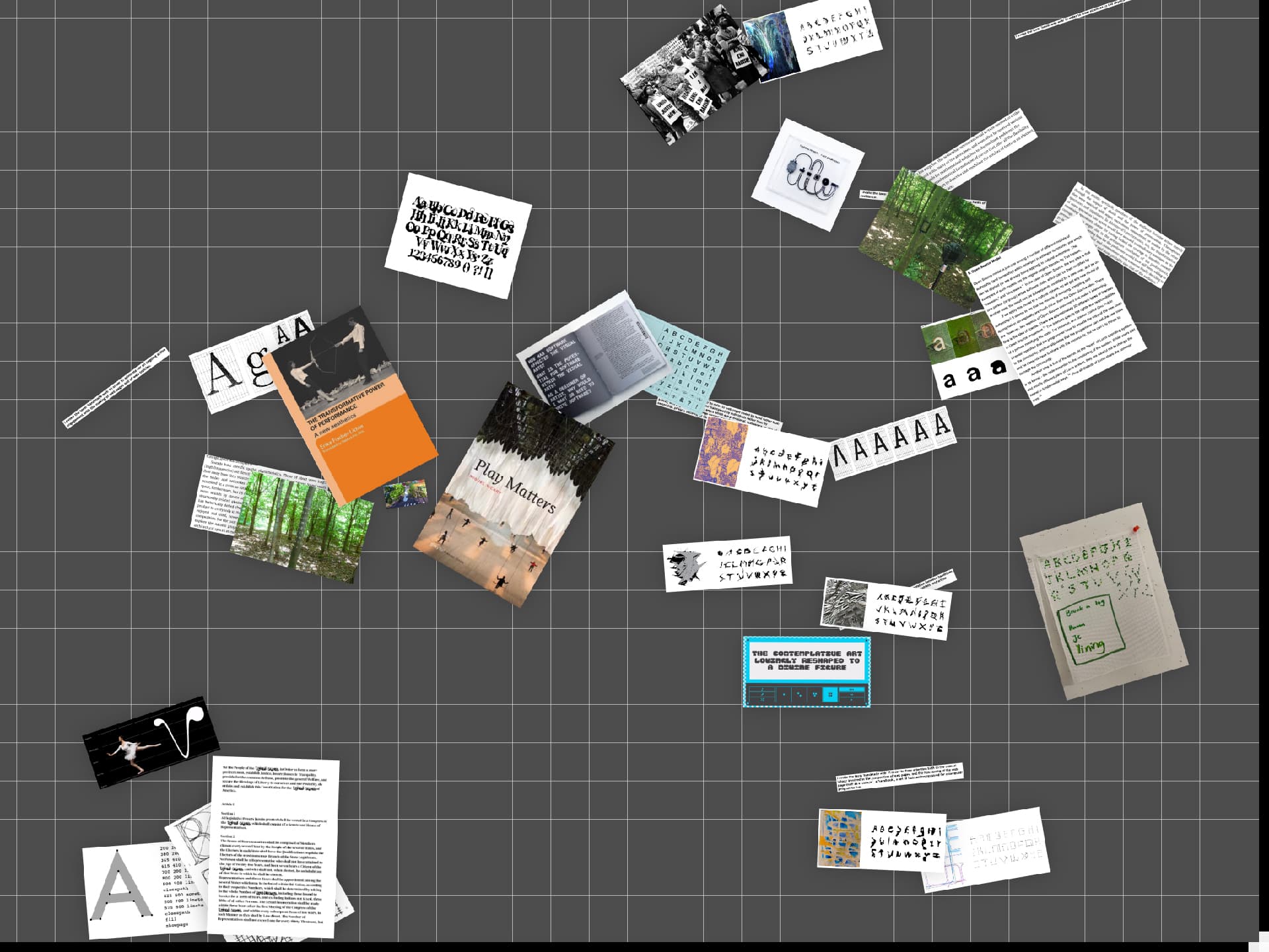
Bethany and Ramon guided us through research-oriented projects that had us looking at places and objects to find deeper meanings and stories hidden within. Our first project was a collaborative publication about our identities, our unique perspectives, and our roles in the local community. The second project was a deep-dive into a specific artifact from the Providence Public Library. I selected a vintage whist playing board, which inspired me to think about games, rules, and what it means to play something. Additionally, this course marked the first time I began collaborating with my peers, developing websites that helped me sharpen and expand my skills as a coder.

What I Learned

How to collaborate
Research methods
Collage techniques
Narrative storytelling
Self-taught How to populate data from a spreadsheet
Self-taught Approaches to generative art using CSS
Self-taught Face detection JavaScript libraries

Graduate Type Studio III, taught by Doug Scott

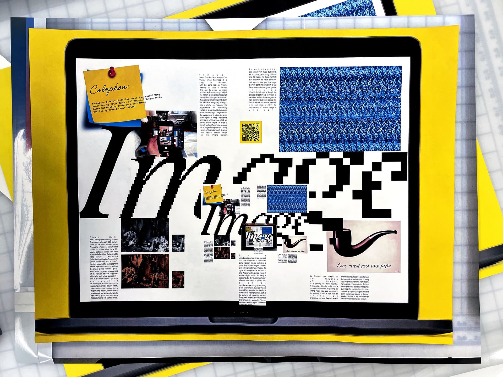
One more course with Doug! Even though this course was the end of the graduate typography curriculum, it covered the fundamentals of typographic terminology, craft, and process. We started with an exercise in rearranging unorganized information into an accessible format, then moved on to typesetting a short book, creating several editorial typographic illustrations, and finally conceiving of a wide-ranging brand identity. Each project started with a practical prompt that emulated “real-world” design work, made even more realistic due to constantly overlapping deadlines.

What I Learned

Methods for organizing information
Editorial typographic illustrations

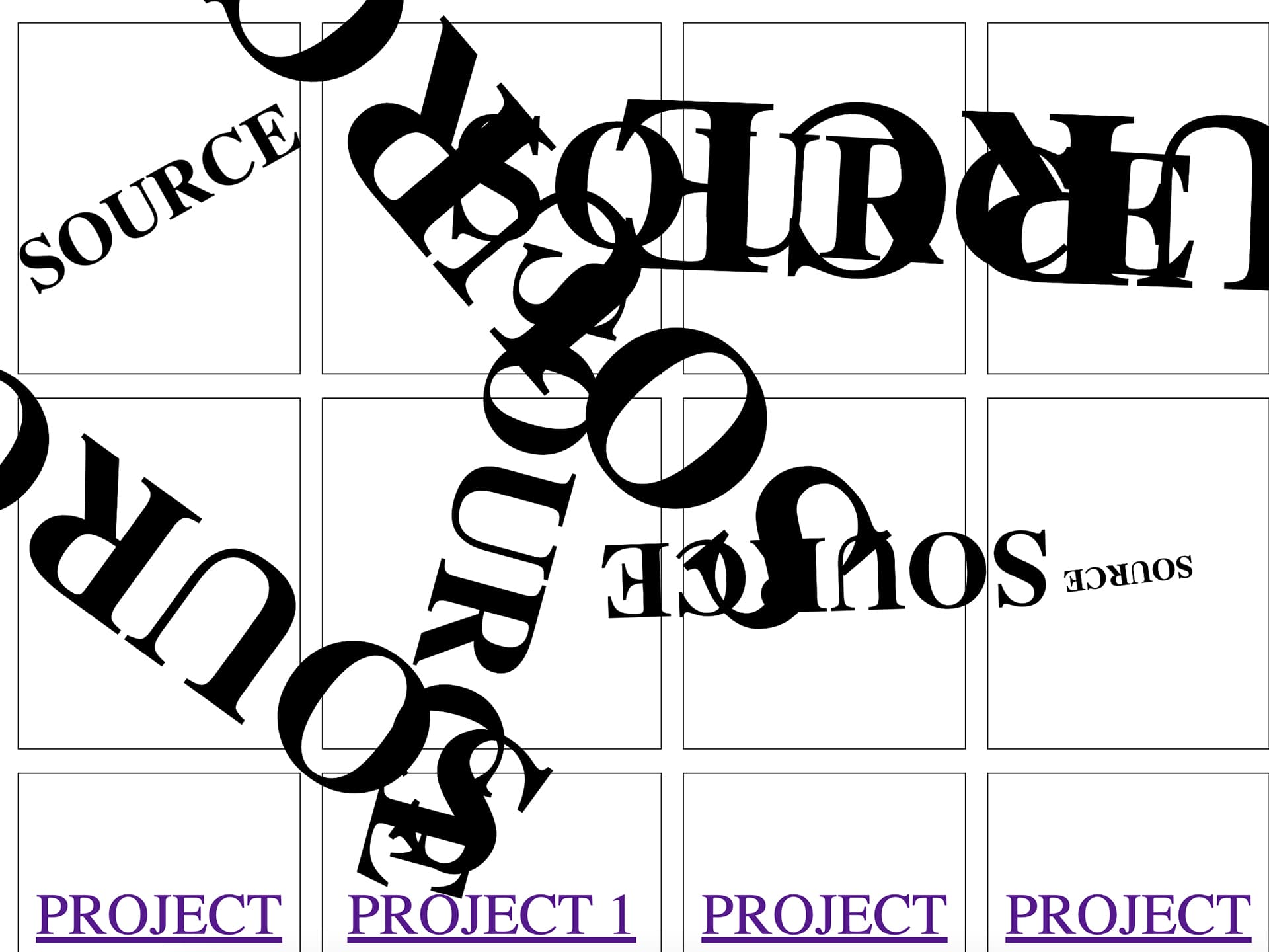
SOURCE, taught by Eric Li

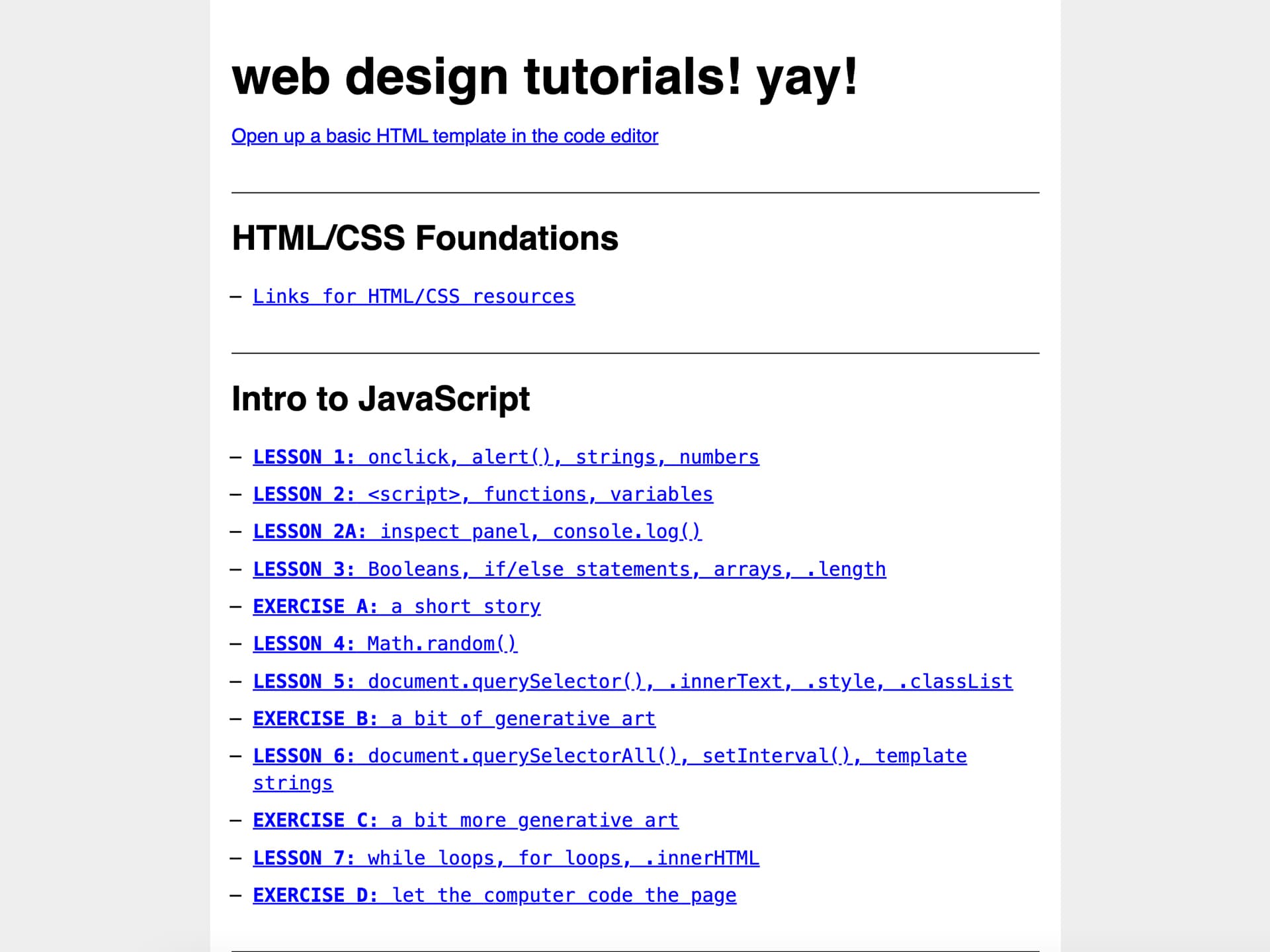
At the time, RISD did not have a core curriculum in coding. This meant that there were frequently thematic coding courses, like Marie’s from before and Eric’s now, that popped up and offered their own take on an introductory web programming curriculum. Eric’s perspective on coding was much more in line with a traditional computer science regimen, which I found helpful in determining best practices and setting a solid foundation to keep building on. This was the first time that I felt like I actually understood how web code worked, and wasn’t just reusing pre-coded demos to create my own projects.

UX Research & Strategy, taught by Aaron Simmons

Aaron’s course exclusively focused on research, with no instruction on user interface design. Our objective was to understand a broad overview of the research that goes into professional user-centric projects. We accomplished this by proposing and completing our own research project over the course of the semester. At the time, I was growing increasingly interested in atypical user experiences, so I used this course as an opportunity to challenge assumptions about the layout of social media sites and propose my own design.

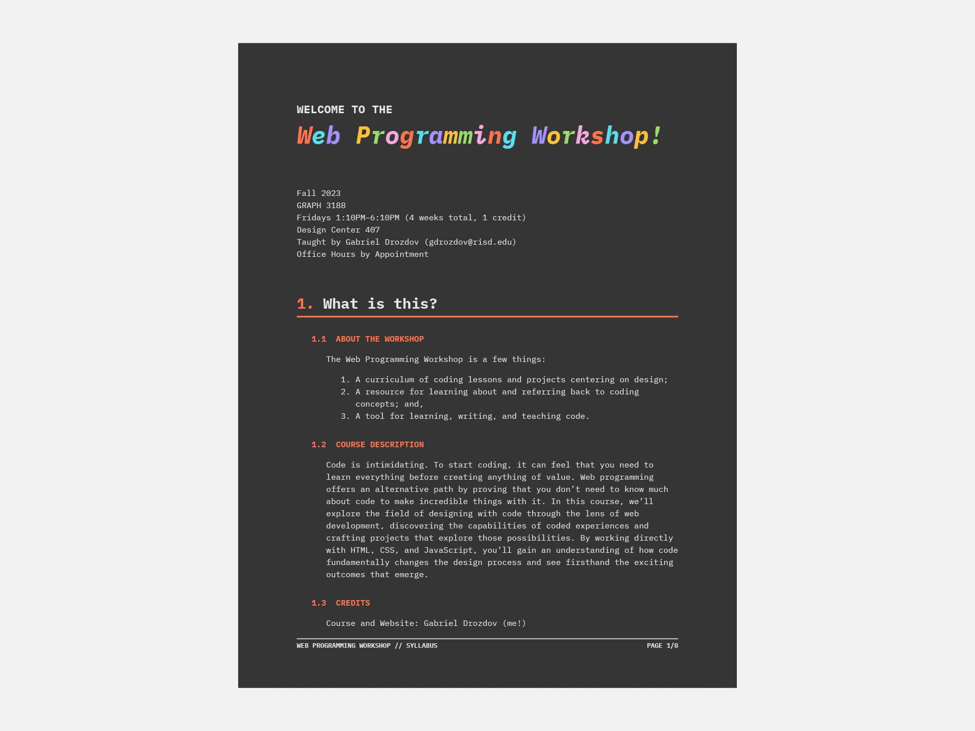
Web Programming Workshop, taught by me!

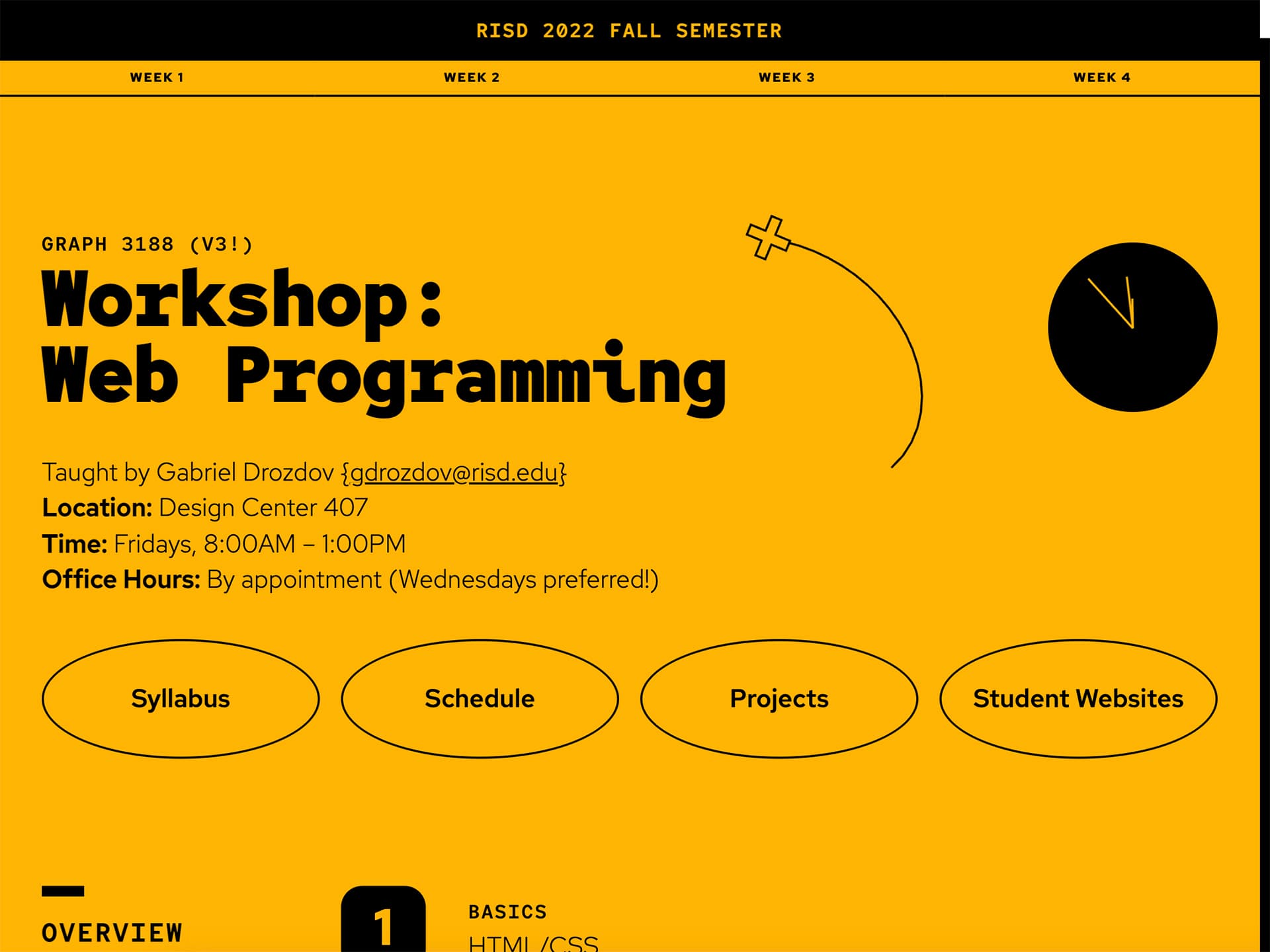
Each semester, RISD offers several four-week workshops that give students an opportunity to learn a specific technical skill. Grad students were occasionally allowed to teach a workshop, so I jumped on the opportunity as a chance to get into teaching. I discovered I was utterly and terribly unprepared to teach, but learned two important lessons: teaching is harder than it looks, especially teaching designers how to code, and; you don’t have to be an expert in a topic to help students learn it. Teaching code actually helped me become a better coder. I was able for the first time to see how sharing my work and studies could help others learn, too.

Winter 2023

I’m not sure about the case at other grad schools, but RISD has a bit of a reputation for stressed-out students. This wintersession was my most stressful term in my entire RISD experience. I taught my first full-semester course, which also required an evening seminar to complete the collegiate teaching certificate. But I was also preparing to teach a workshop in the spring, so I took an open research course to get guidance for making teaching materials. And, I had my first big professional web programming gig. In other words, I had a whole bunch of stuff going on.

Graduate Open Research, taught by Ryan Waller

Ryan’s course let us propose topic we wanted to work on with the support of a weekly meeting. I planned to teach my own variable fonts course in the fall, so this was a chance to develop the materials ahead of time. What initially started as a basic website evolved into a full-fledged type testing tool with a distinctive musical personality. Every week, Ryan pushed my idea further, and it was up to me to figure out what the limits of my ability to code were. I ended up with a significantly more complex project than I thought I was capable of at the start.

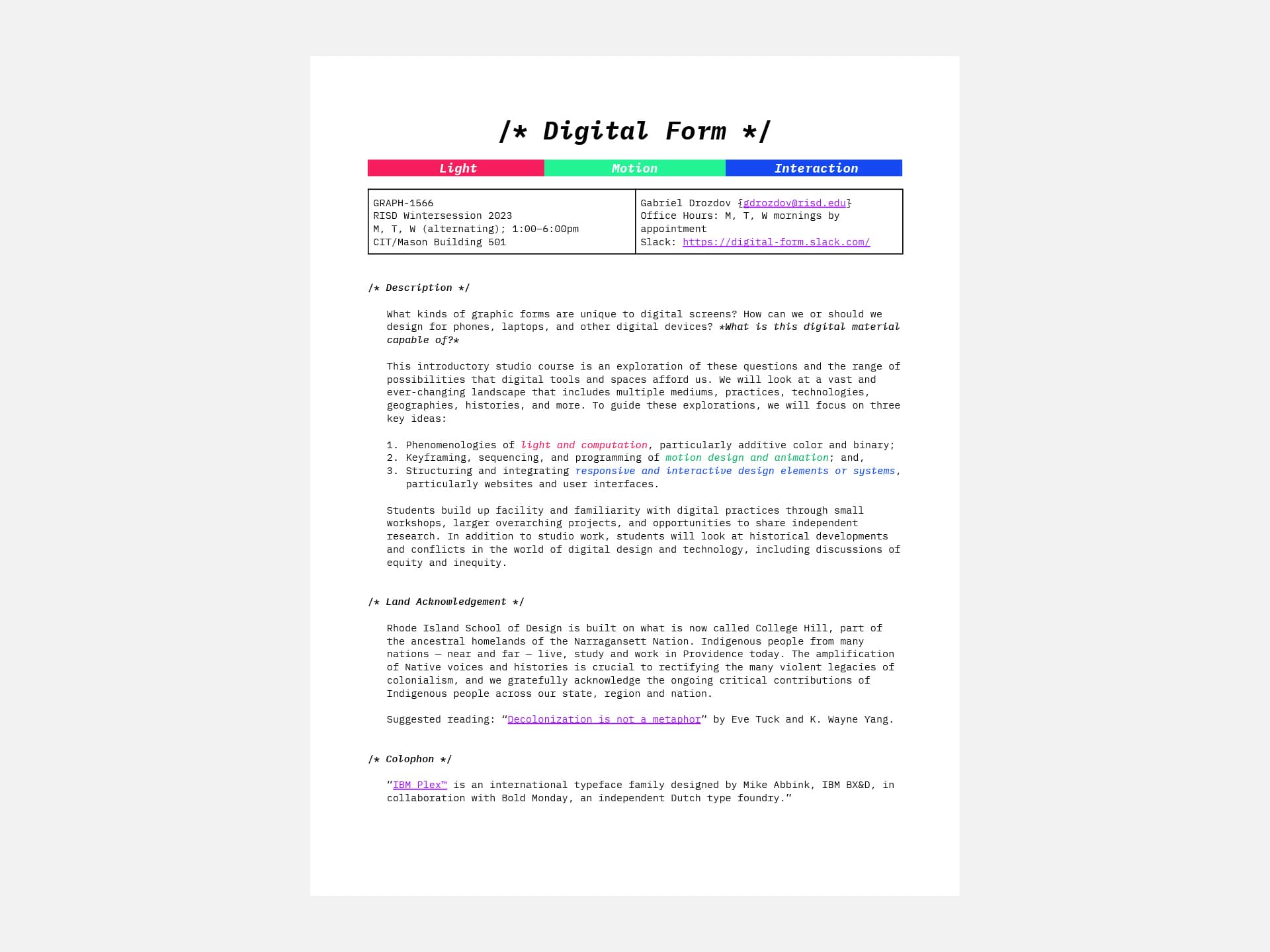
Digital Form, taught by me!

This course marked my first time teaching an original semester-long curriculum. The curriculum covered what I considered the gamut of digital design practices: static design, motion design, and web design. Through teaching, I discovered the limits of what I could teach in a given set of time, but was equally amazed at what students could accomplish with just a basic set of tools at their disposal. The real challenges, though, were the weeks in which I had to teach my five-hour class meeting three days in a row. That’s just an impossible thing to prepare for.

Collegiate Teaching Practicum, taught by Mairead Byrne

Right after teaching my own course, I had to attend a supportive seminar required for all graduates teaching during wintersession. At first, I was frustrated by the requirement, but luckily Mairead recognized our stress levels and used this meeting as an opportunity to work through the challenges we faced during our time teaching. It felt special to be in a room where everyone was a teacher, and I held on to that experience later on when I began developing resources for students and teachers alike.

Freelance Web Design and Development

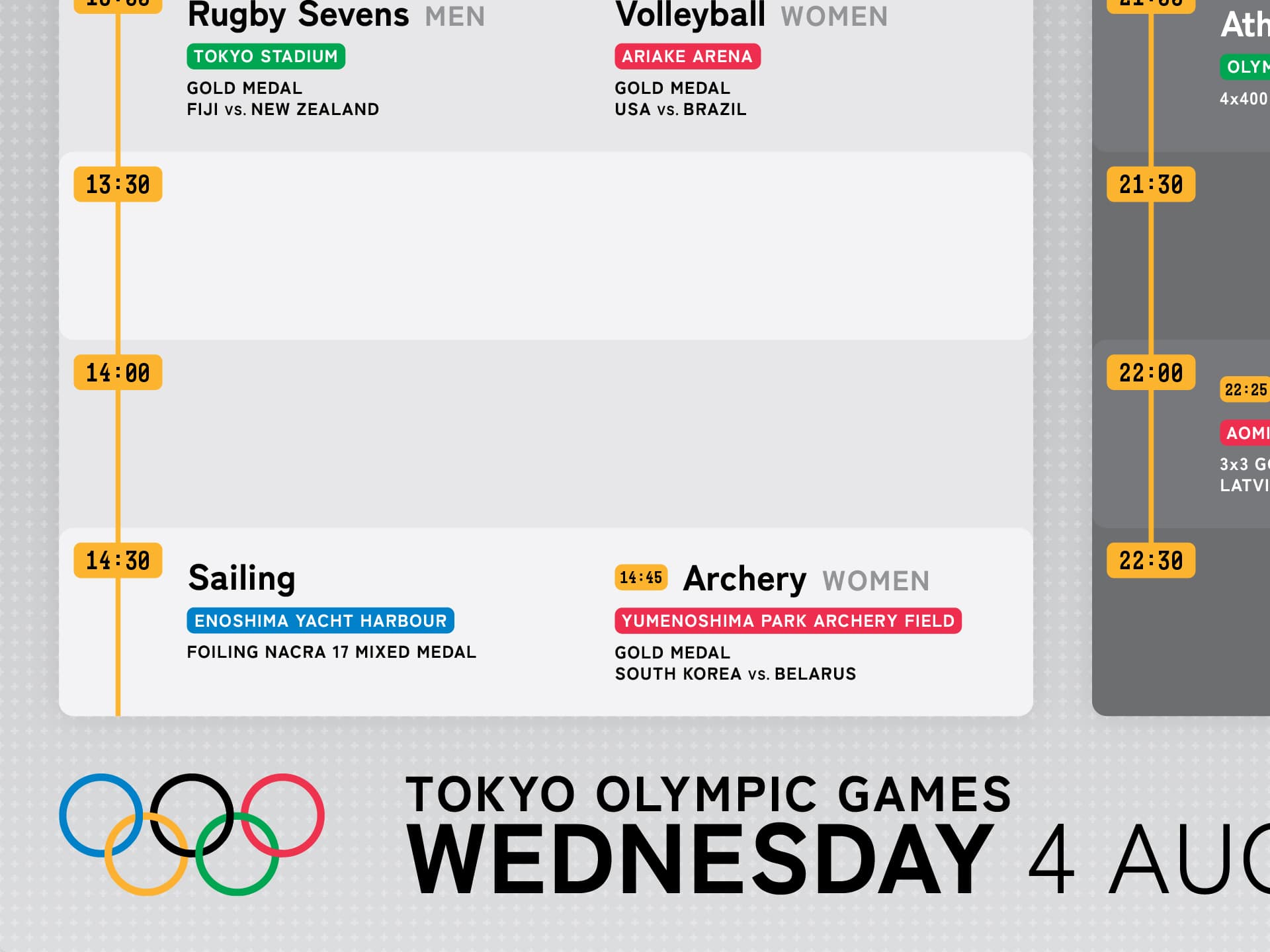
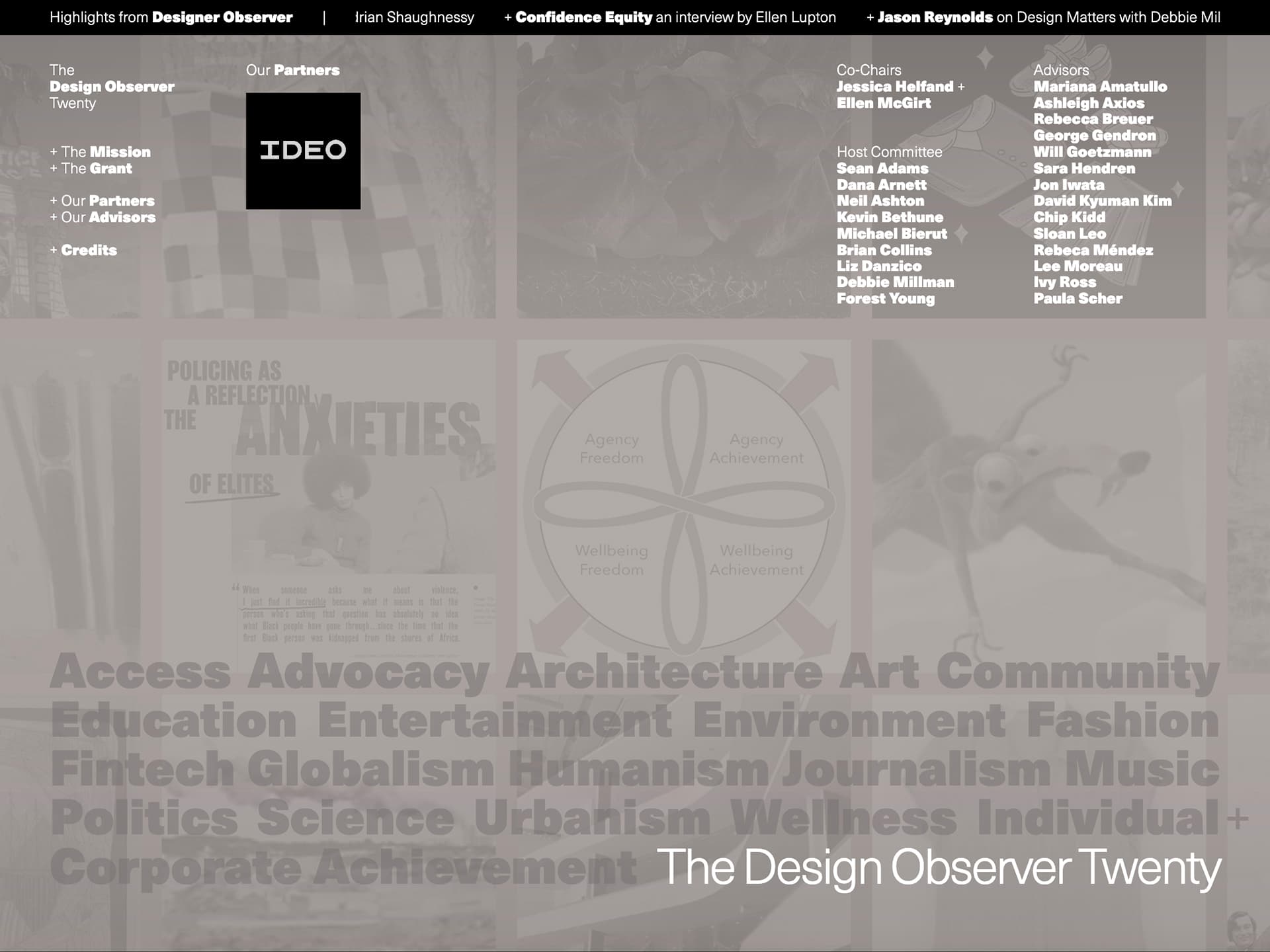
With two web courses and some experience teaching code under my belt, I felt confident enough to take on some web-based freelance work. I worked with Design Observer to create a sibling site for their upcoming twentieth anniversary, which coincided with an award ceremony. Their team provided me with initial design mockups, which I implemented and expanded upon to include elements of motion and generative design. By the end, I realized that abstract and creative uses of code actually had a practical place and purpose in “traditional” sites like this one.

Spring 2023

Halfway through the program! This semester called on us to start thinking about our perspective on design in the context of our eventual theses, which we would start writing the following semester. By this point, I was starting to have fewer “first” experiences, and instead spending my time honing the design, coding, and teaching skills I had picked up in prior semesters.

Graduate Studio II, taught by Lucy Hitchcock and Paul Soulellis

Lucy and Paul’s course followed in the prior semester’s footsteps and featured open-ended projects about identity, place, and audience — really, about what it means to maintain a creative practice. I found myself struggling even from the first assignment, for which I created something I liked the idea of but couldn’t fully commit to for some reason. In the end, I realized that the project was not consistent with my voice — it was too abstract in a way I simply couldn’t relate to. So, the second project allowed me an opportunity to pivot toward something less abstract and more like me. From thereon, my values as a designer were rooted in accessibility through this lens of direct (and often deliberately educational) communication.

Graduate Seminar II, taught by Paul Soulellis

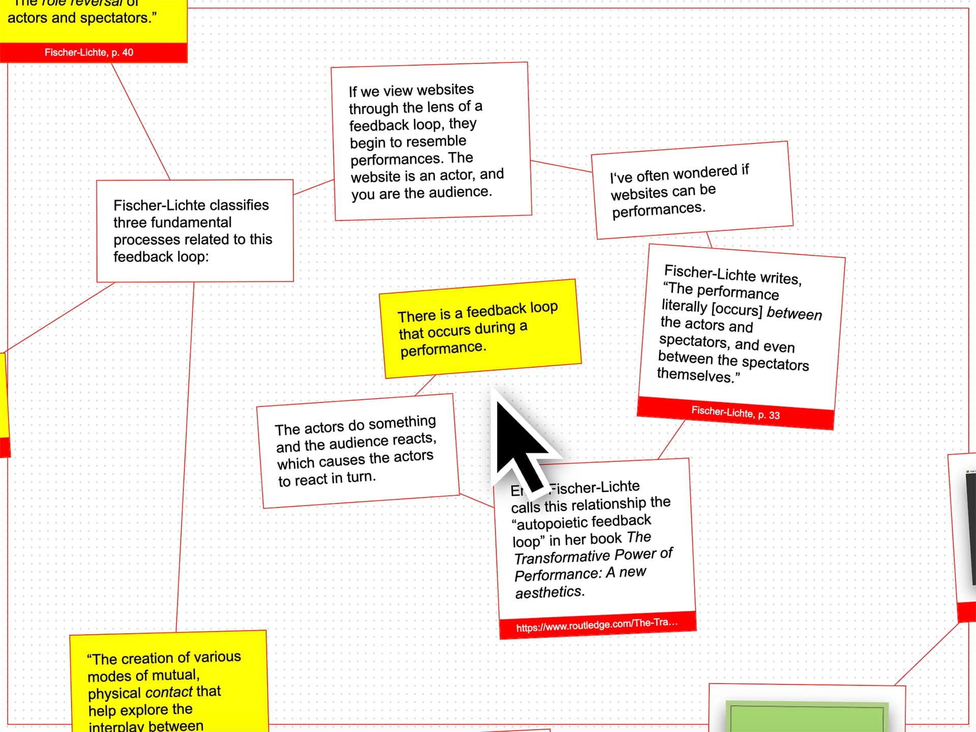
Paul’s seminar focused on discovering our individual approaches to design in preparation for our theses. We spent a vast majority of the semester working on our “thesis compendiums” — books that would essentially function as our thesis proposals. But I had just broken my wrist. So instead of making a book, I went full force on a digital-first approach that reckoned with the ideas of originality and authenticity. I called my web-based book “A Thesis Compendium” to acknowledge that my project was the framework for a book, but not an actual copy of the book itself. Instead, the website generated print-ready PDFs using a wide variety of design parameters.

Techlands, taught by Shona Kitchen and Georgia Rhodes

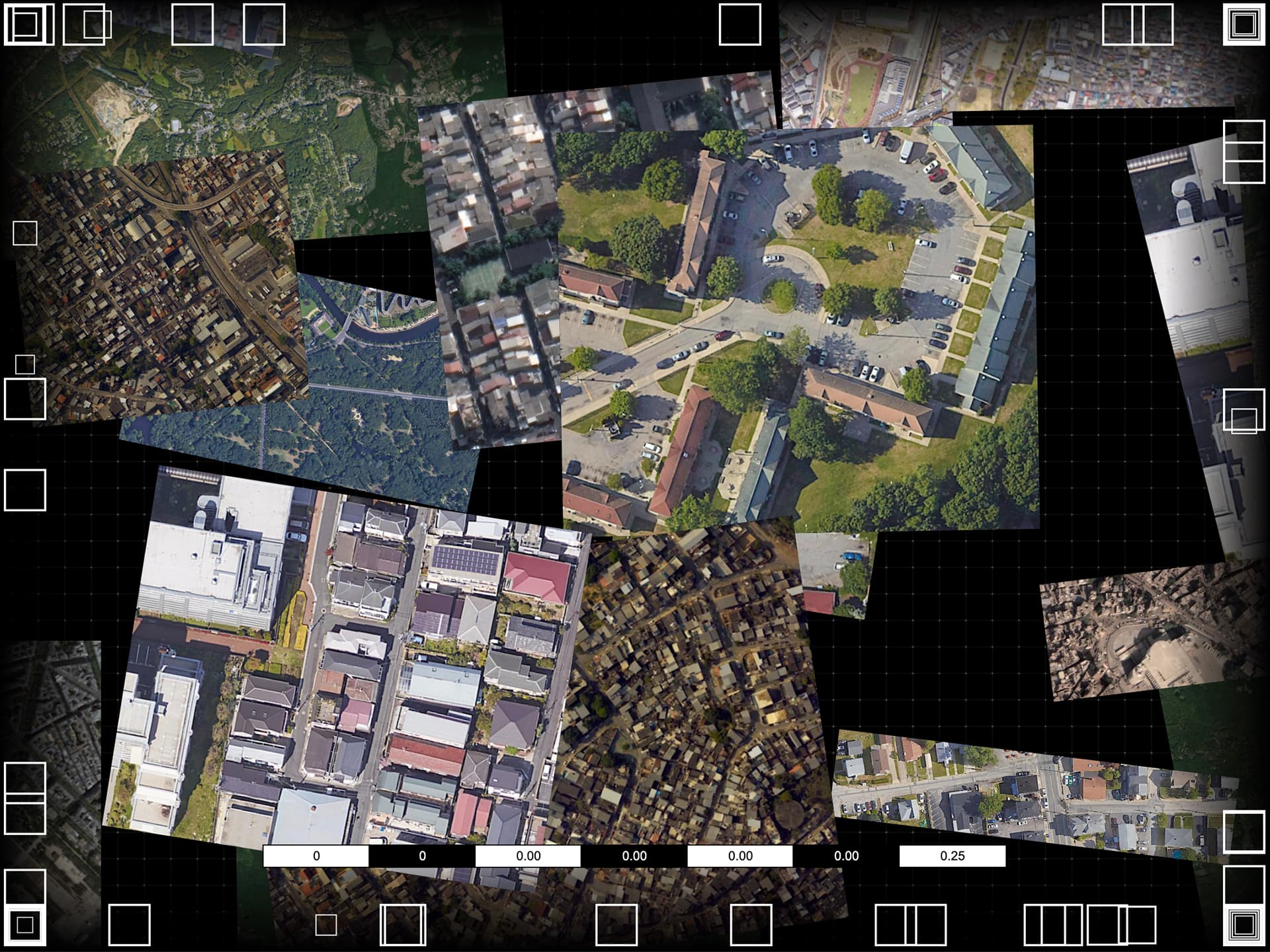
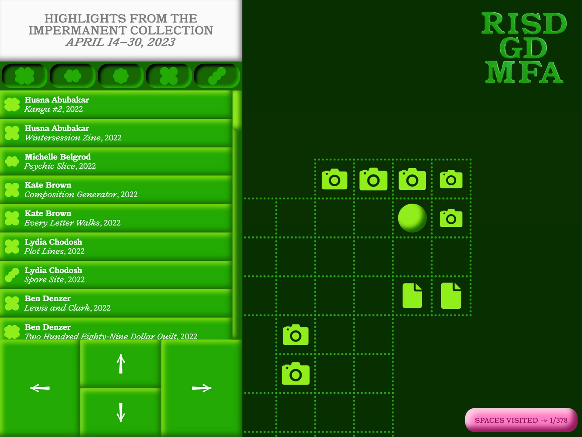
Techlands was a research-oriented Digital + Media course in which we worked on personal projects that engaged with the environment around us. We conducted field research through several site visits that explored locations in Rhode Island as a means for collecting material and searching for inspiration. One of these endeavors resulted in the content for my first project in Graduate Studio I. Besides that, I continued to create work in the vein of the user experience investigations I had started in prior semesters.

Type Design Independent Study, taught by Richard Lipton

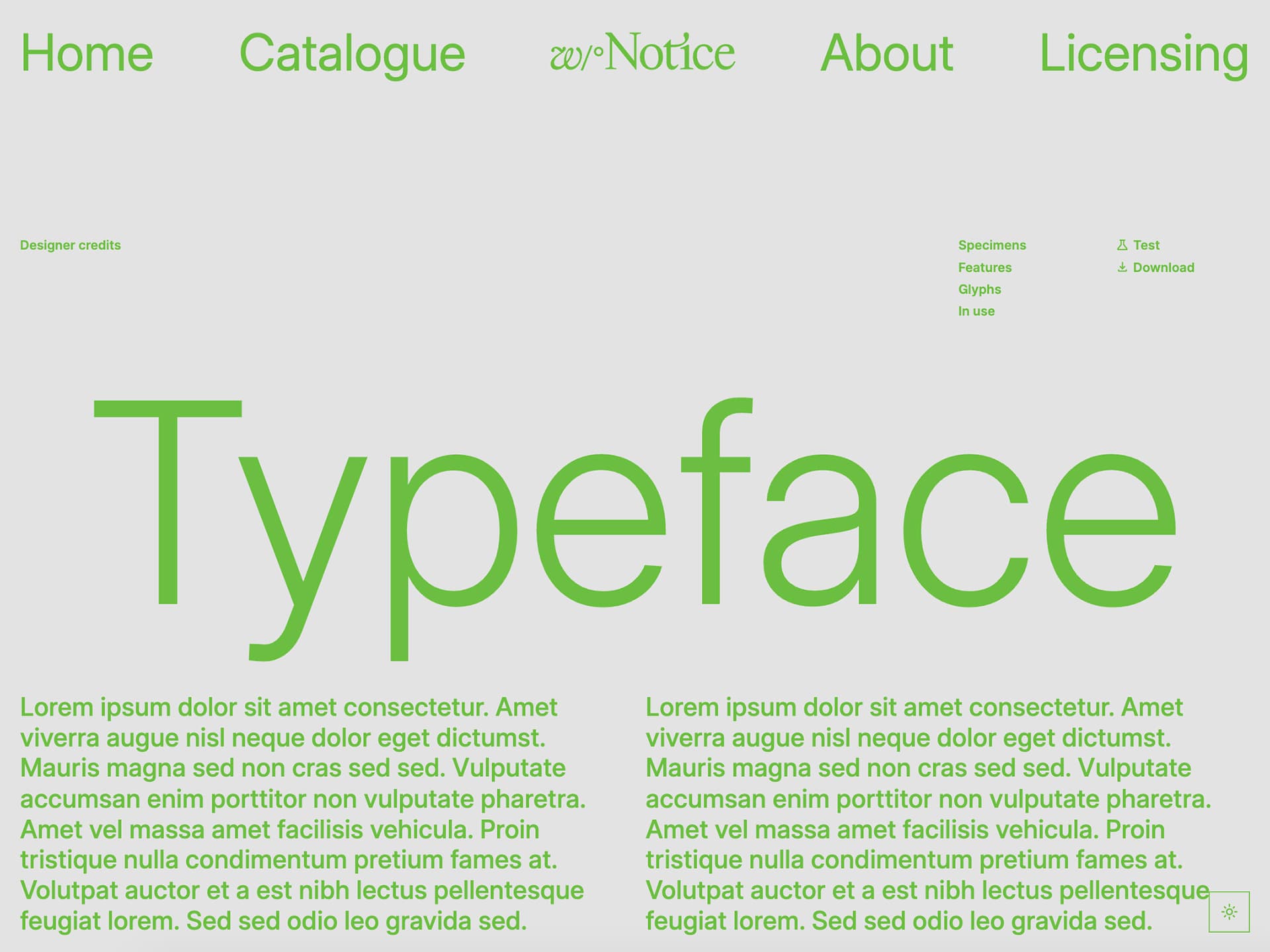
Now in my third type design course at RISD, I worked with Richard on expanding my font Limkin, which I had created in Cyrus’ class. Richard’s approach to type design focused on craft, with roots in hand lettering and some of the more “traditional” aspects of type design. With Richard’s guidance, I designed a sans serif variant of Limkin, as well as hairline and heavyweight versions. And, using lessons from Marie’s course, I was able to turn Limkin into a variable font, which meant that I could interpolate the in-between weights and even use the typeface as a flared, half-serif version. I would go on to use this typeface for many projects, including this thesis!

Variable Fonts Workshop, taught by me!

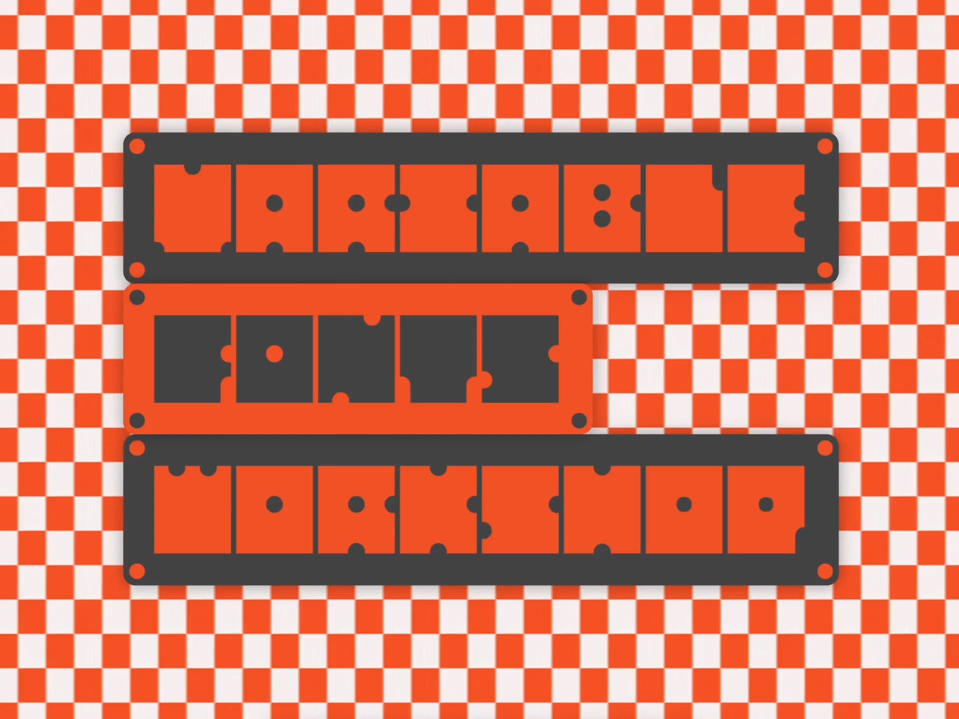
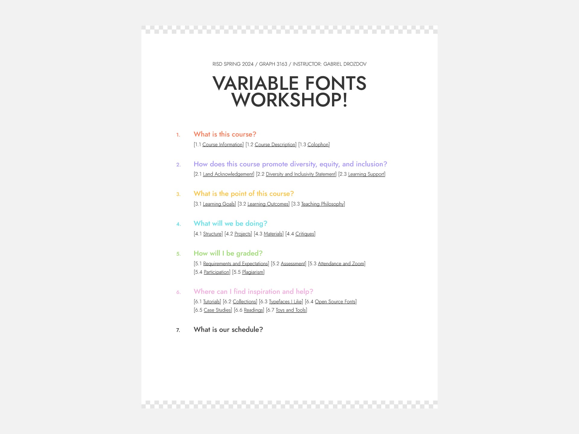
I wanted to follow in Marie’s footsteps, so I proposed my own workshop that gave students a chance to design variable fonts. Since most of our type design courses focused on craft and precision, I figured mine could focus on experimentation. In the course, I encouraged students to learn the technology, play with it, and see what forms it could result in. And, I was able to incorporate the tool/website that I had created during the winter as the class website and a showcase of student work.

Collaborations

I really enjoyed collaborating with my peers during the previous semester, so I kept that practice going! I designed and developed the website for our graduate biennial, as well as coded three final projects for peers in the grad and undergrad programs. With the first two of these projects, I was learning how to scale up a single design into a larger, generative system. That meant populating the website’s contents from a spreadsheet instead of manually coding every element.

Summer 2023

I had really enjoyed my last summer internship, but felt at this point I no longer wanted to be an intern. So, I instead decided to spend my summer working on my own projects, polishing everything I had made so far, and documenting my work. The work you’ve seen already throughout this thesis is in part the product of my time spent during this summer. Things like my studio projects from the spring semester were much rougher until I spent this summer fixing them up.

Freelance and Personal Projects

In terms of new work, I continued to create websites incorporating practices and ideas from prior semesters. One of these was a freelance project for a music school, whose website features a fully-functional piano keyboard. I also remade my project Pixel Weaver to incorporate more controls and a new user interface, as well as converted some code from my project Notes from Neither Here nor There into a musical toy of sorts. Lastly, I created a small save-the-date website to invite family members to my wedding!

Fall 2023

The final year of RISD’s curriculum is mainly dedicated to our theses. A RISD thesis takes the form of a book, which includes research, essays, interviews, and projects. Of our two final semesters, we spent the first one creating new work, and the second one putting that work into a final book form.

Graduate Thesis I, taught by Bethany Johns and Anther Kiley

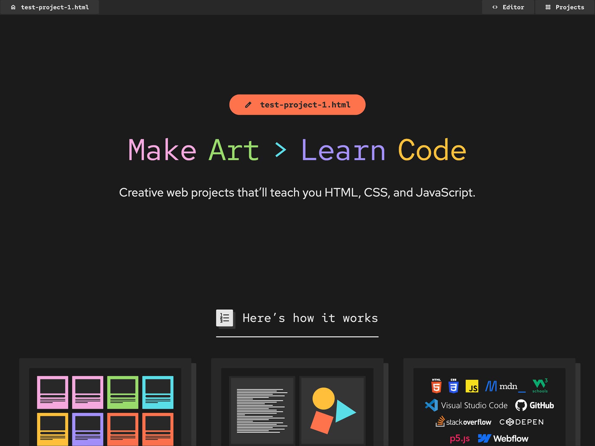
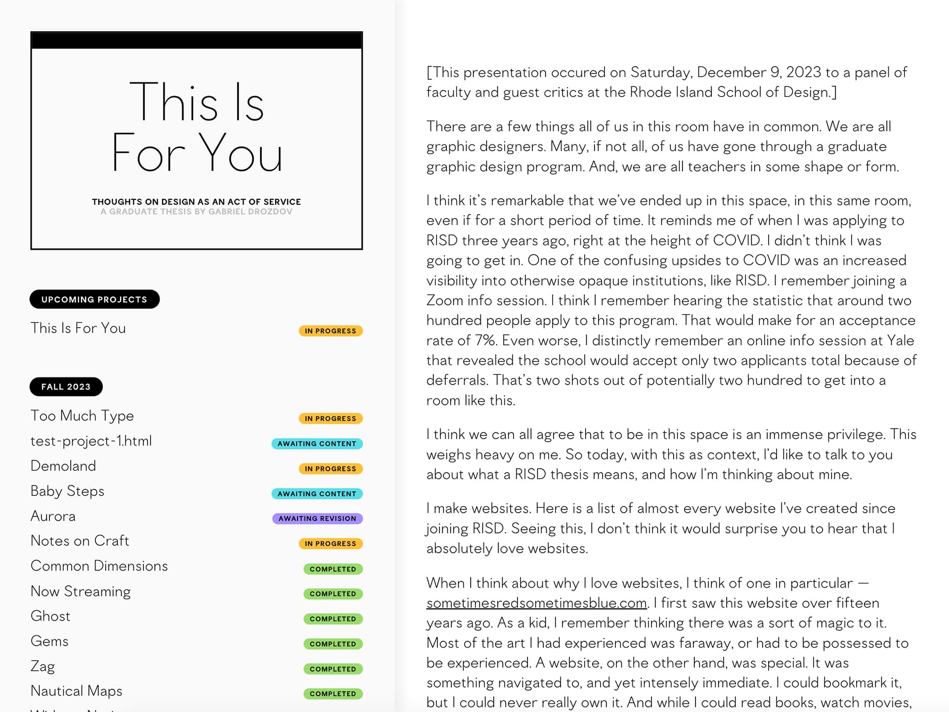
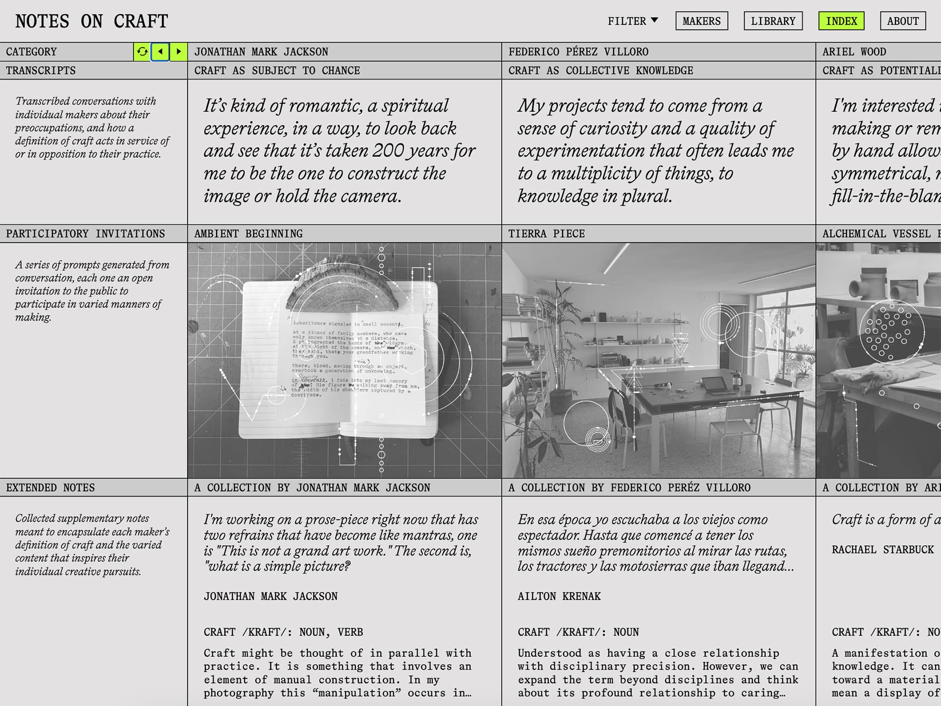
To formally propose our theses, we had to give short talks on what our research and work would look like for the following year. In my presentation, I talked about organizing my output into a few buckets: type design, education, and studio work. So, I ended up creating a website for my type foundry, which featured all the fonts I had made at RISD so far. After that, I worked on a variety of educational websites aimed at teaching code to designers. Besides those personal projects, I collaborated with my peers on several websites and also made a couple of smaller sites for presenting ideas pertaining to my thesis.

Data Narratives, taught by Reuben Fischer-Baum

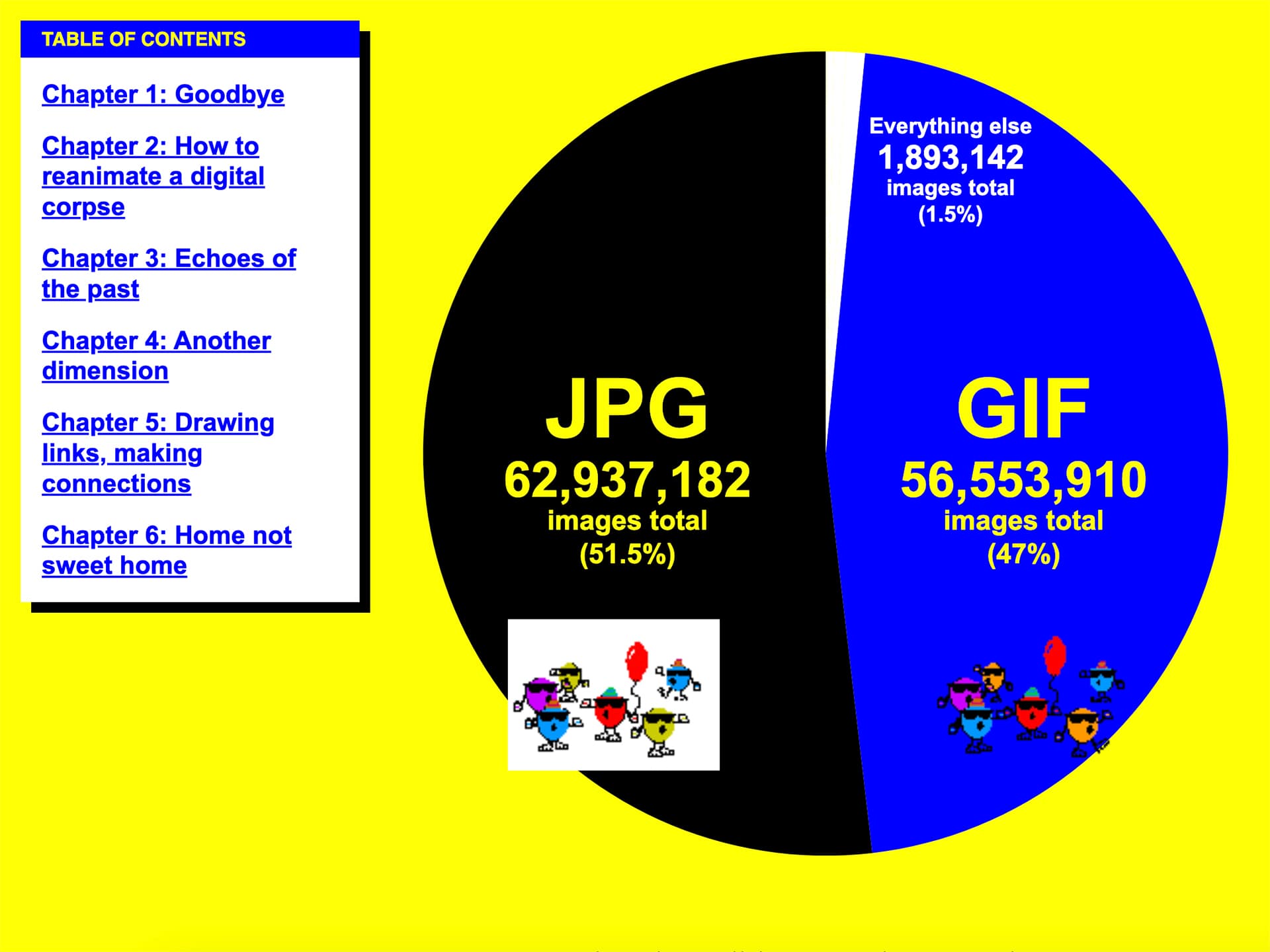
Reuben’s course taught the programming language R in the context of data visualization. I was Reuben’s teaching assistant (but also taking the course). For my final project, I really wanted a challenge of working with “big” data, since that’s what felt special about using R as opposed to simply working out of a spreadsheet. I discovered a massive dataset (more than one billion rows of data) archiving info from the defunct GeoCities community, and I created an interactive digital article collecting my findings.

Newly Formed, taught by Christopher and Kathleen Sleboda

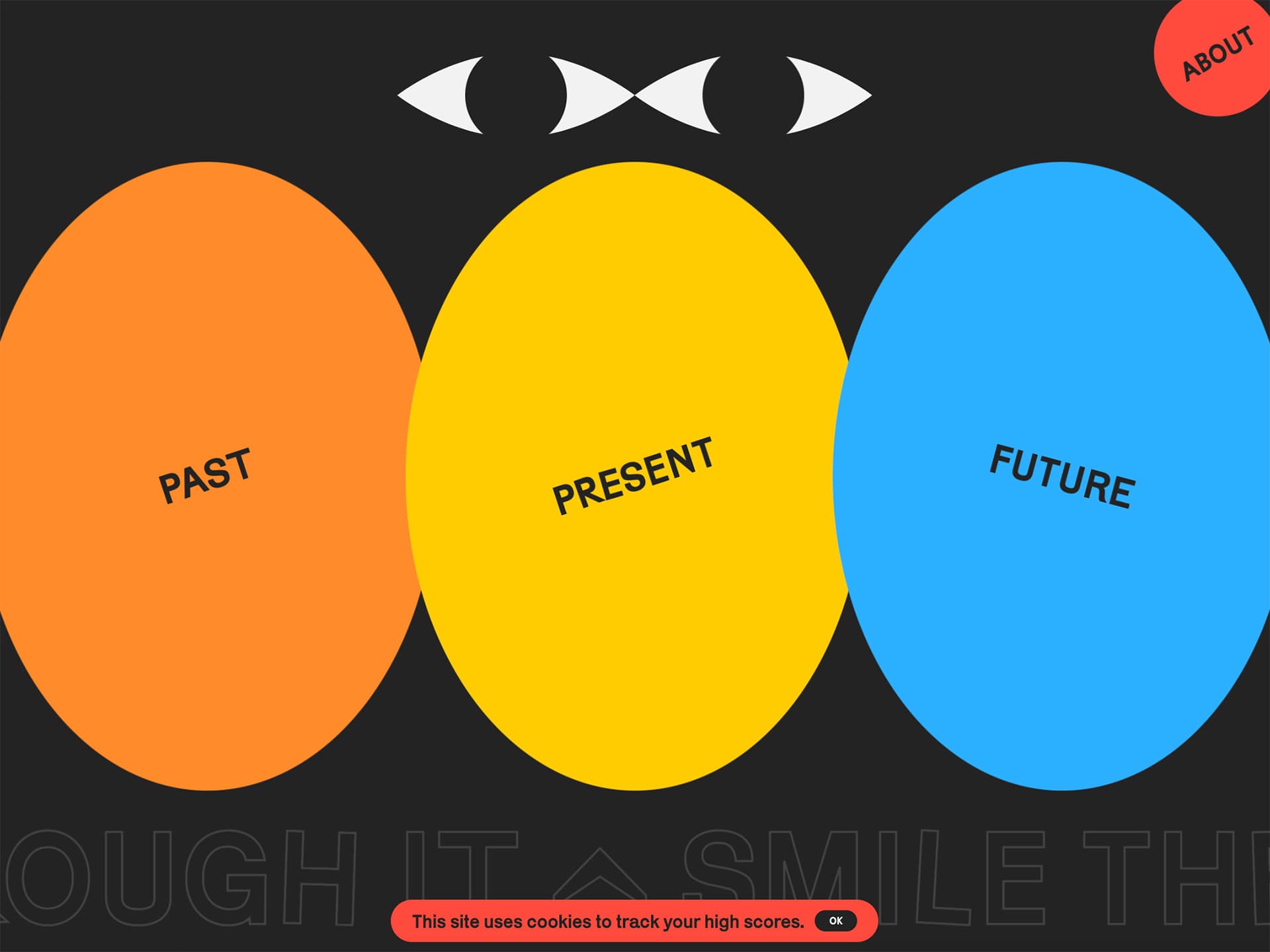
This course was a prime example of learning through the process of making. Each week, we had a new open-ended assignment and only the week in which to complete it. Therefore, we all ended up with a massive output spanning a wide range of concepts and forms. I used the course as a chance to tackle some projects and techniques that I felt I never had the time for, like a website that played the Animal Crossing soundtrack in real time (a personal love of mine).

Web Programming Workshop, taught by me!

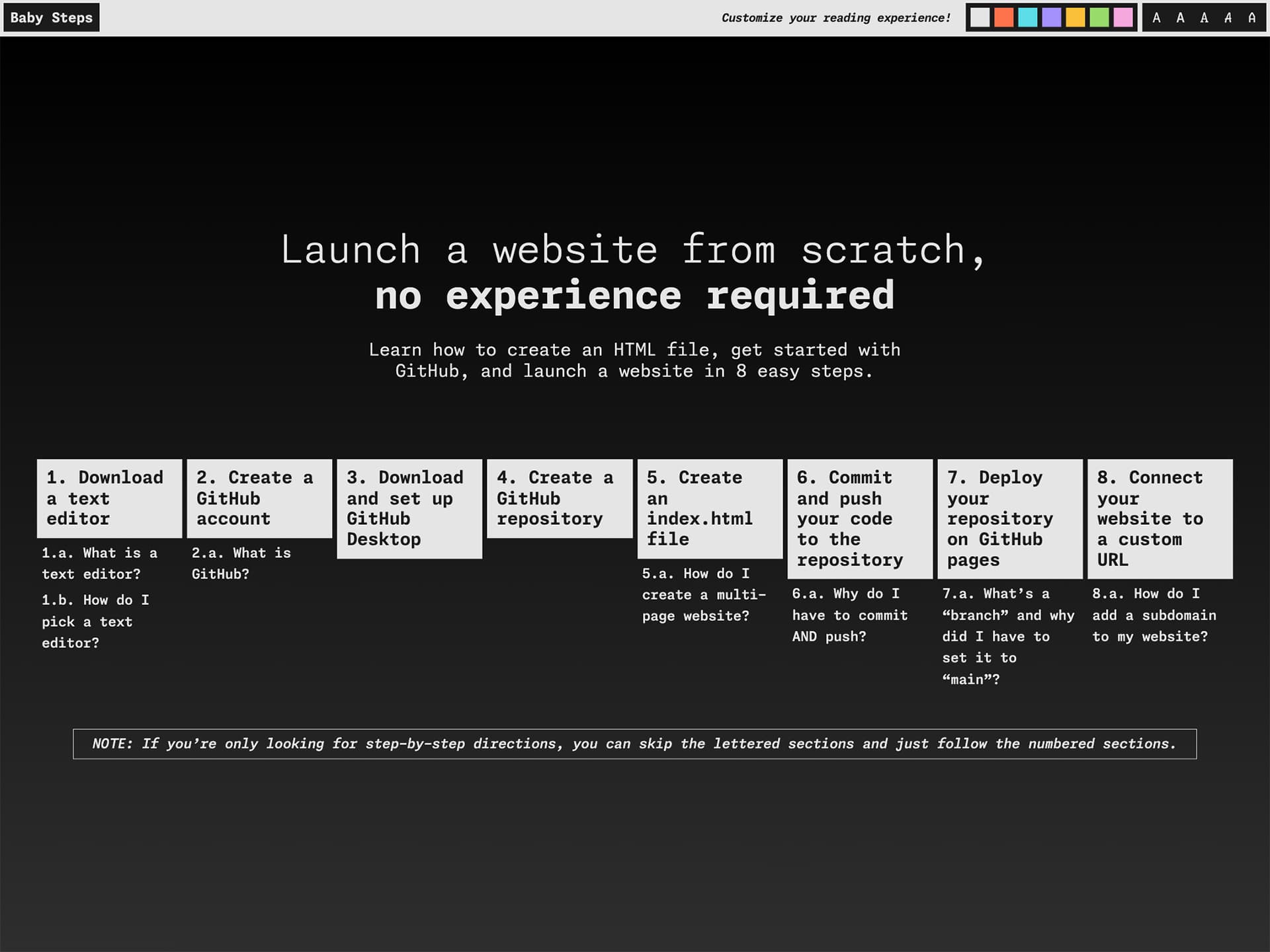
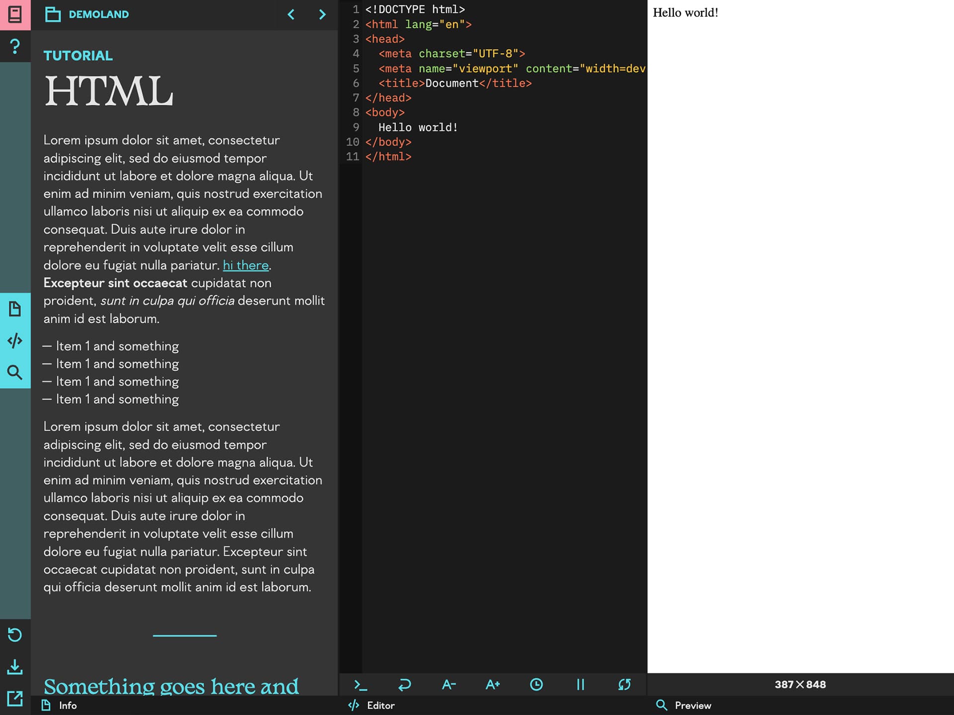
For my second time teaching the workshop, I used a new custom-coded website I had developed over the summer. This site featured an in-browser text editor, which I had learned how to implement while making my project Small Sites; Big Stories. In practice, this website proved to be way too complicated and large in scale that I couldn’t maintain it, and I resorted back to using my original workshop website from the year before. That’s the nature of user experience — you don’t know if things will work unless you actually let people try to use them.

Collaborations

I continued to see collaborations as opportunities to focus on technical skills as opposed to design. In my own practice, I was coding individual webpages less frequently and instead finding ways to generate my code off of data from spreadsheets. At the same time, my peers were also moving away from smaller-scale projects and into things like publications that repeated designs across several pieces of content. It turned out that my newfound coding skills were a perfect fit for these kinds of design formats. The one drawback, though, was that I over-volunteered myself and had to eventually drop a project (a type foundry website for recent alums) that I didn't have time to complete.

Winter 2024

In our last wintersession, we usually take a thesis-oriented workshop that lets us kickstart interviews and thesis writing. Instead, this year featured a different kind of required class as an opportunity to keep creating new work. On top of that, I taught another wintersession course, this time fulfilling one of the department’s web programming slots instead of proposing a course of my own design.

Lights, Camera, Thesis, taught by Teddy Blanks and Jessica Helfand

Teddy and Jessica’s course had us creating trailers and title sequences for our theses as a means for generating new work and figuring out what our theses were really about. At this point, I was fully dedicated to web-based practices and building tools and frameworks instead of complete, final projects. So, I made a variety of websites that could make these projects for me, and then edited screen recordings of my sites for our final critiques.

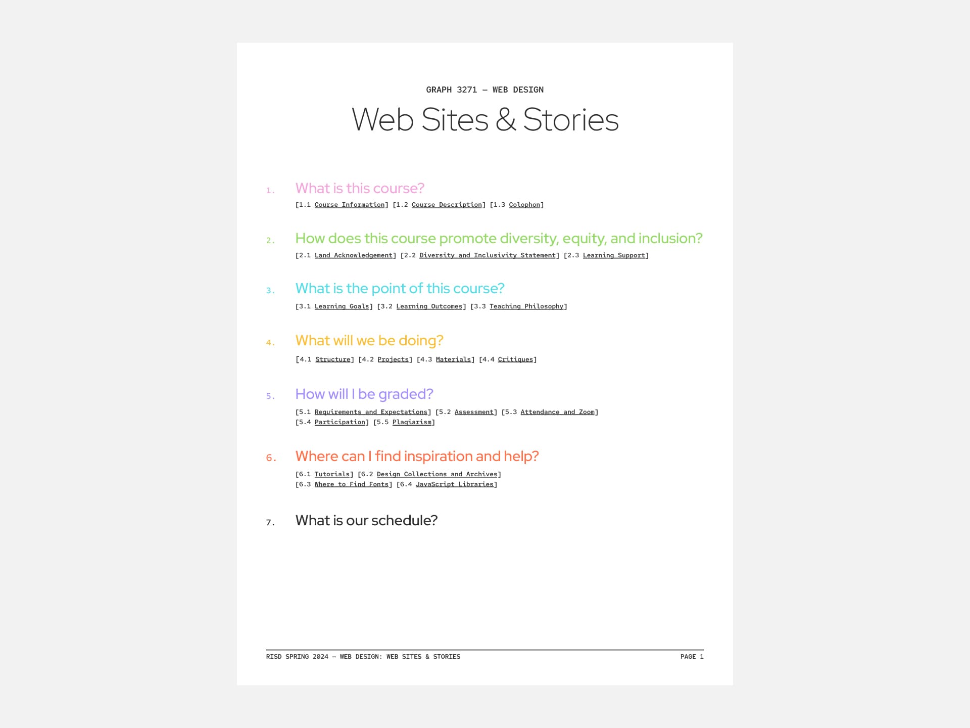
Web Sites & Stories, taught by me!

Even though I had taught two full semesters of coding workshops already, I had never taught a full-semester coding course. For this class, I tried utilizing some of the tools I had made during my first thesis course. These projects featured prebuilt demos and organized resources that encouraged students to code creative outputs at any skill level. But like my experience with the workshop during the fall, I discovered some user experience issues that made teaching difficult. What ended up working was just spending as much one-on-one time as possible with each student to tackle their individual needs.

Freelance Web Design and Development

Working with my friend and peer Rebecca, I had another opportunity to put my graduate research into practice. In this case, I developed the website for a Toronto-based restaurant. While the website mostly features a typical user experience, the homepage incorporates a generative piece of art as a way of making the site stand out without disrupting its accessibility.

Spring 2024

The end! (Almost.) Our final semester was a mad dash toward the finish line. We had to write our theses, design the books that the writing would go into, and then produce copies in time for our final reviews. On top of that, we still had to meet credit requirements, think about the digital components of our theses, and prepare for our lives after school. No big deal, right?

Graduate Thesis II, taught by Bethany Johns and Pouya Ahmadi

Bethany and Pouya guided us to the end of our experiences at RISD. We came up with plans for finishing our theses, and over several weeks I kept adjusting my concept until it arrived at what you’re reading right now. I realized that what would be most helpful for my likely audience was a direct account of what grad school was and what it taught me. I also realized that to do so was not feasible in the time I had, and would not be fun to read in the format of a PDF of a book (as most people would encounter it). So, fully embodying my identity as a web designer, I made my thesis into a website first and a book second.
Color Workshop, taught by William Miller

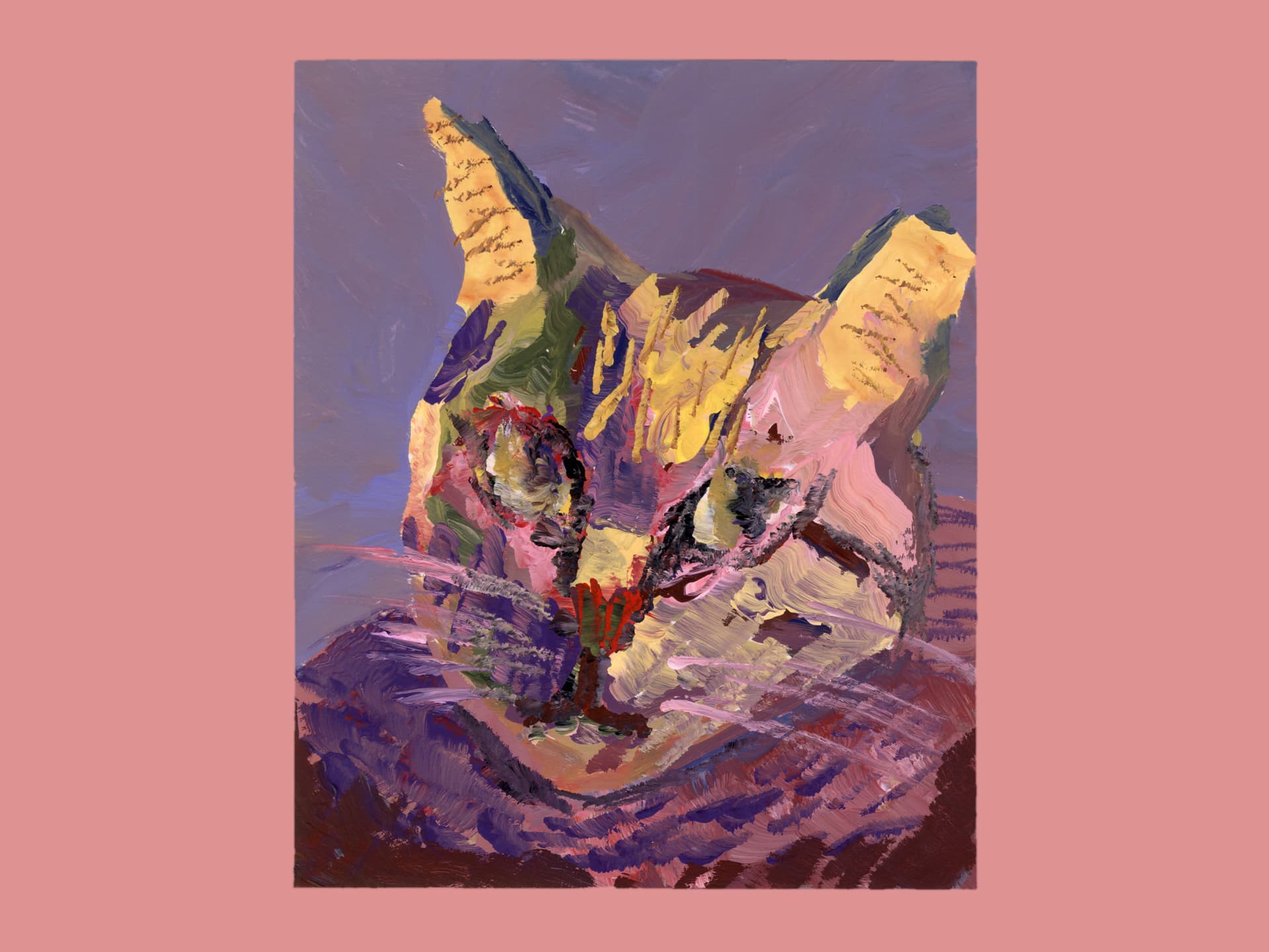
Bill’s course was a meditation on color theory in the context of gouache painting. Our weekly meetings were structured around color studies, each taking on the same dimensions but focusing on different topics pertaining to color theory. While my thesis endeavors were frantic and stressful, this course was not. As Bill put it on the first day of class, we would move at the same pace that paint moved at — not very fast. By the end of the course, I had a terminology and respect for color in a way I could not articulate beforehand.

RISD Grad Show 2024

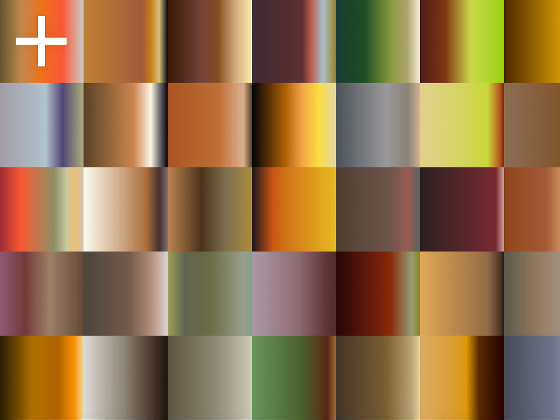
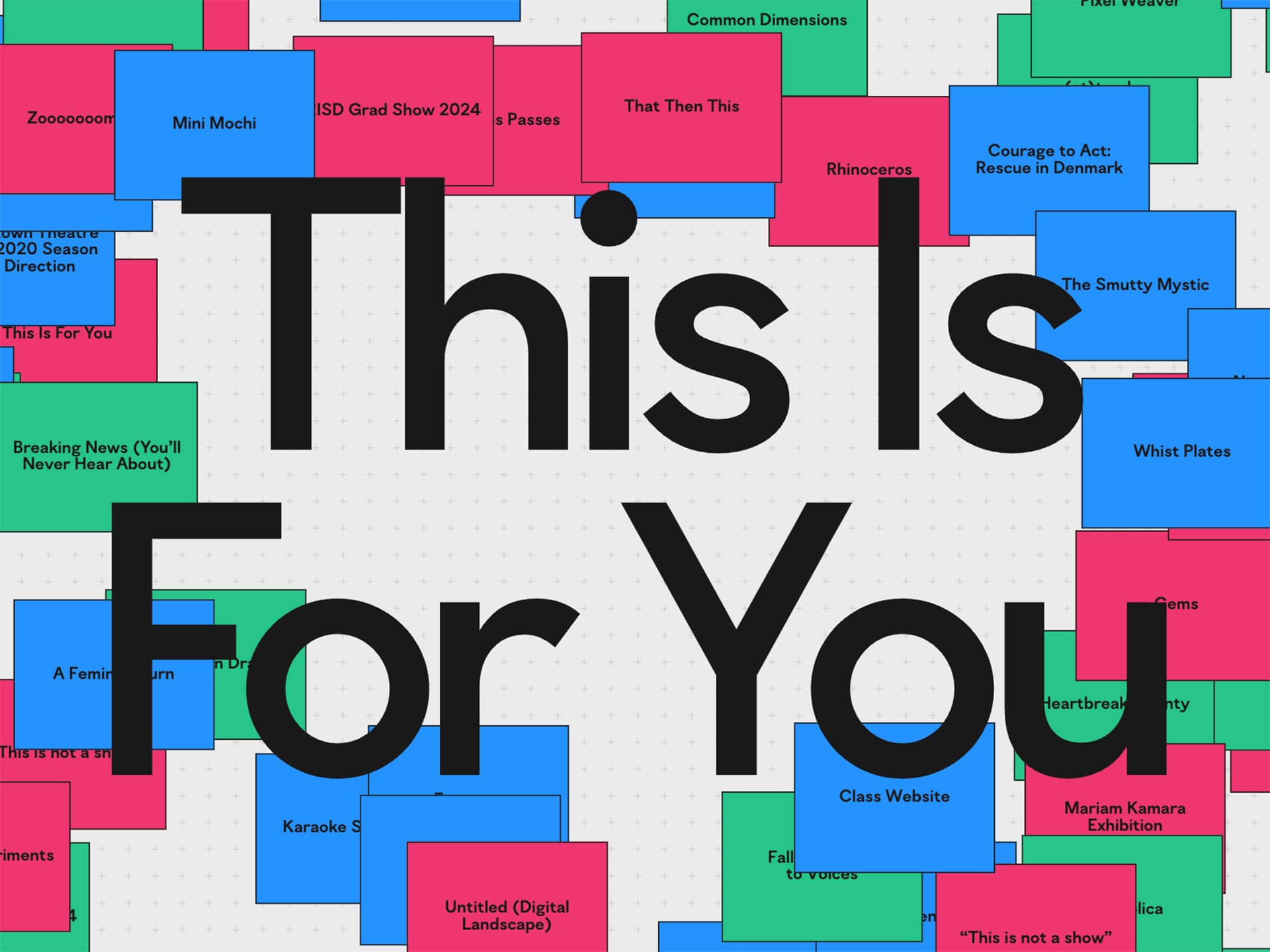
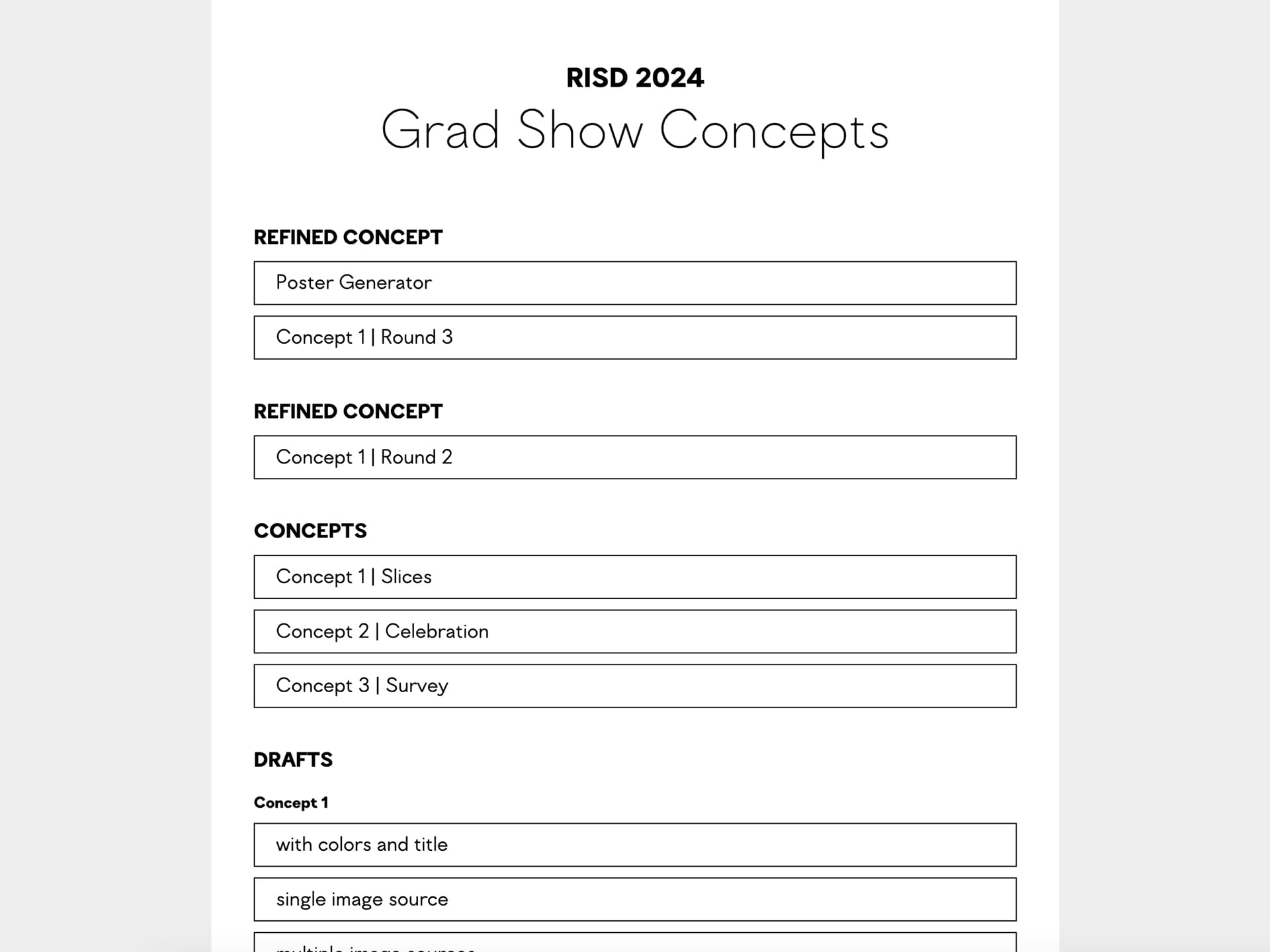
The school chose me, along with my friend and peer Emily, to create the identity and website for our grad show. We really wanted the identity to be joyous, colorful, and most importantly to somehow incorporate student work. Using techniques I had picked up from making Pixel Weaver, we discovered that we could generate a field of color by zooming in closely on images of student projects. So, the resulting identity did not have a single color palette, but instead directly referenced the colors used in student work.

Variable Fonts Workshop, taught by me!

My last time teaching as a student! I was treading old ground with the Variable Fonts Workshop. Usually, I used each section as an opportunity to switch things up and try to improve the course. This time, I took the opposite experiment and kept it almost identical each time. I discovered that I was previously overworking myself — the formula was working totally fine already. I also began developing a new version of the class website that made use of my improved coding and design skills.